I have built several landing pages over the years, including a few of my own. I have picked up a few tips and tricks that have worked and learned a few things that could have been better.
After years of trial & error, research, and asking questions, I decided it was time to share what I have learned in case it can help save someone else some time.
In this article, I’ll unpack the purpose of landing pages and delve into the crucial elements that make up an effective landing page design.
A Comprehensive Guide to Landing Page Design and Purpose
This guide will explore the purpose of a landing page and provide expert tips for effective landing page designs that will increase leads and sales.
What Is a Landing Page
A landing page is a website page that stands apart from the rest of the site specifically designed for marketing or advertising campaigns. It is where a visitor “lands” after clicking on a link from an email, social media post, search engine results page, or an online advertisement.
The principle goal of a landing page is to drive a specific action or conversion, such as registering for an event, signing up for a newsletter, downloading an eBook, registering for a webinar, or making a purchase.
Unlike a typical website homepage, which often serves as a general introduction to a business or organization, a landing page is highly focused and targeted towards a particular audience segment and campaign objective.
It typically contains a clear headline, persuasive copy, a call-to-action (CTA), and relevant visuals, all designed to drive visitors to a specific action.
Here Are Some of The Key Reasons Why You Would Use a Landing Page
Targeted Marketing
Landing pages can be designed for specific marketing campaigns and target audiences, allowing you to customize your messaging and content to resonate with a particular segment, resulting in better engagement and higher conversion rates.
A great example of this would be the industries you serve. For example, an IT company may work with specific sectors such as manufacturing, medical or dental; they may want a landing page with exact keywords and services specific to that industry.
Another example would be a location such as a town, city, or state. If you service multiple cities, it makes sense to have a landing page targeting each city so that you can reach people searching for your service in that particular area.
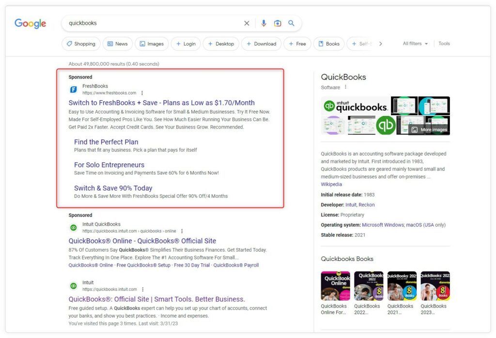
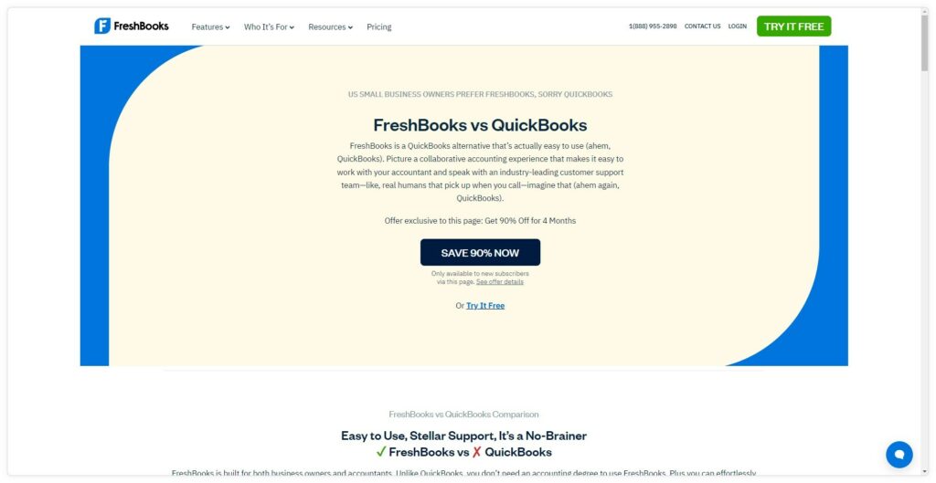
FreshBooks is a competitor to QuickBooks and they made a landing page that compares Freshbooks to QuickBooks. They also have a paid targeted ad that makes them come up first when someone types “QuickBooks” into the Google search engine.
Clear Focus = Improved Conversion Rates
Unlike a homepage with multiple objectives, a landing page focuses on a single goal, such as capturing leads or driving sales. This clear focus makes it easier for visitors to understand what action to take and reduces the likelihood of distractions.
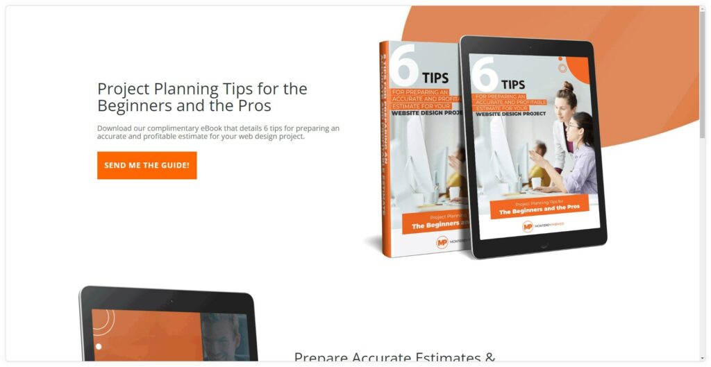
Some landing page gurus even suggest removing the menu in the header and the footer that you would normally have on standard website pages. This is because you want the visitor to stay focused and complete the desired action.
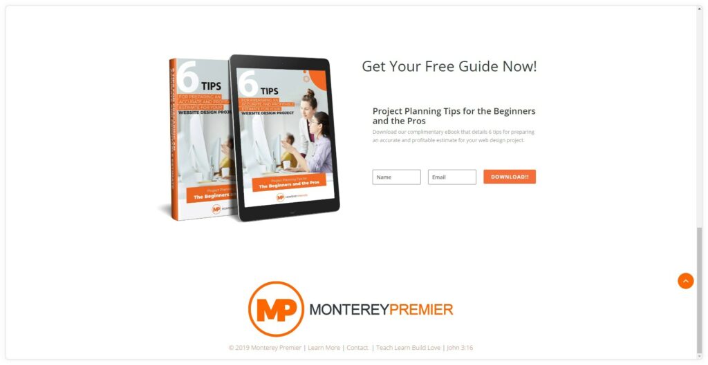
I followed this advice on one of my own free e-book landing pages.
Measurable Results
Landing pages make it a little easier to track and measure the performance of your marketing campaigns, giving you insights into conversion rates, visitor behavior, and other valuable data.
This information can help you optimize your campaigns and make data-driven decisions to improve results. It also helps refine your keyword performance to support your overall SEO strategy.
Lead Generation
Landing pages are also an effective tool for capturing leads. They typically include a lead capture form or a call-to-action (CTA) that encourages visitors to provide their email address or other pertinent contact information in exchange for something of value, such as a free eBook or a webinar registration.
In summary, you would use a landing page to create a targeted, focused, and measurable user experience that drives specific actions and improves the overall effectiveness of your marketing campaigns.
What Makes a Great Landing Page Design
A good landing page design effectively conveys your message, encourages visitors to take action, and ultimately increases conversions.
Here are some essential elements of a successful landing page design:
Clear and Simple Layout
The layout should be clean, uncluttered, and easy to navigate. Focus on a single goal or call-to-action (CTA) to avoid overwhelming the visitor.
Break up large sections of text with headings, images, or bullet points to make your content more digestible.
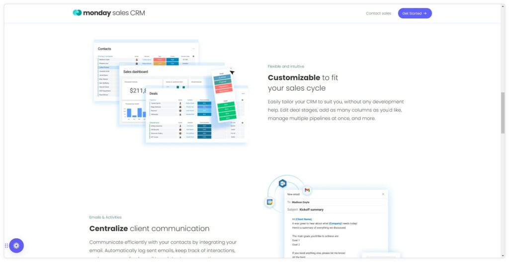
Monday Sales CRM’s landing page does a great job of breaking up the content into smaller chunks with more headers. They also have a minimalist header menu.
Strong, Visible Call-To-Action (CTA)
A clear and visible CTA improves the overall user experience, making it easy for visitors to understand what action you want them to take. By making your CTA stand out, you are also guiding visitors toward the primary goal.
If the page is long and has a lot of content, I suggest placing a CTA throughout the page. If your CTA is a form, then place buttons throughout that takes you back up or down to the actual CTA.
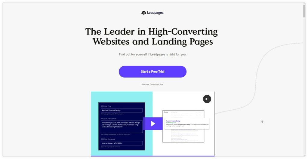
Leadpages has a clear and simple layout, clear and easy to find call to action, and no distracting menus or other links.
Optimized For Better Search Engine Results
While a witty headline and subheadline can capture visitors’ attention and motivate them to engage with your content, be sure to pay as much attention (if not more) to the proper use of h-tags and keywords.
H-tags (such as H1, H2, H3, etc.) are used to organize your content into a hierarchical structure, making it easier for users and search engines to understand the flow and organization of your content. For example, a well-structured page with clear headings and subheadings is more likely to rank higher in search engine results.
Researching and implementing a keyword strategy is also essential for optimizing various elements of your content, such as titles, headings, meta descriptions, image alt tags, and URLs. Using keywords strategically throughout your content creates a cohesive and well-optimized page that is more likely to perform well in search results.
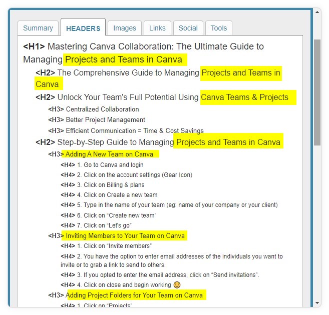
Here is an example from one of my recent blog posts with the following highlighted keywords used in the headers.
Consistent Branding
While you may be tempted to experiment with new designs, fonts and colors, I recommend trying to stay on brand. Align your landing page design with your overall brand identity, using consistent fonts, colors, and imagery to create a cohesive visitor experience.
Use eye-catching images, graphics, or videos to support your message and make your landing page more appealing. Avoid using stock images if possible, as they may detract from your unique value proposition.
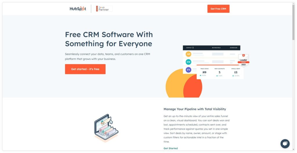
HubSpot landing pages like this one are a great example of all the above tips including consistent branding.
Additional Considerations when Designing Your Landing Page
- Mobile Responsiveness: Ensure your landing page is optimized for various devices, including smartphones and tablets, as a significant portion of web traffic comes from mobile users.
- User-Friendly Navigation: If your landing page includes additional content or pages, ensure the navigation is intuitive and easy to use.
- Social Proof: Incorporate testimonials, case studies, or endorsements to build credibility and trust with your visitors.
- Fast Loading Speed: Optimize your landing page to load quickly because a slow-loading page can lead to high bounce rates and lost conversions.
- Accessibility: Design your landing page to be accessible for users with different abilities, following Web Content Accessibility Guidelines (WCAG).
By incorporating as many of these elements as possible into your landing page design, you can create a visually appealing and effective page that maximizes conversions and helps achieve your marketing goals.
How Much Does It Cost for A Custom Landing Page
The cost of a custom landing page can vary greatly depending on several factors, including the complexity of the design, the functionality required, the platform used, the experience and reputation of the designer or agency, and the timeframe for project completion. However, here’s a general breakdown of the potential costs:
Freelance Designer
If you hire a freelance designer, you can expect to pay anywhere from $50 to $200 per hour, depending on their experience and skill level. For example, a custom landing page can range from a few hundred dollars for a simple design to a few thousand dollars for a more complex, feature-rich page.
Design Agency
Hiring a design agency will typically be more expensive than working with a freelancer, with rates ranging from $100 to $400 per hour or more. The total cost for a custom landing page from an agency could vary from $1,000 to $15,000 or more, depending on the scope of the project and the agency’s reputation.
DIY Approach
You can choose to create a custom landing page using a website builder like Divi or landing page platform like LeadPages. You’ll have to factor in the cost of the platform subscription, which can range from $20 to $200 per month or more, depending on the features and level of customization available.
While this approach may be more affordable, it requires more time and effort and may yield a different level of quality than working with a professional designer.
Additional costs
Regardless of the route you choose, there may be additional costs involved in creating a custom landing page. These include stock images, custom illustrations or photography, copywriting, and third-party tools or integrations required for specific functionality.
Remember that these are general estimates, and the cost of a custom landing page for your specific project could be higher or lower depending on your unique requirements and the professionals you choose to work with. Therefore, it’s essential to research the designers or agencies and carefully evaluate their portfolios and experience before deciding.
Equipped with The Knowledge to Optimize Your Landing Page Design
In conclusion, landing pages play a pivotal role in the success of your digital marketing campaigns. By understanding their purpose and the key components that contribute to an effective landing page design, you can create targeted, high-converting pages that drive results for your business.
From captivating headlines and persuasive calls-to-action to visually appealing design and mobile responsiveness, every aspect of your landing page should be carefully crafted to resonate with your audience and encourage them to take the desired action.
Remember, the ultimate goal of a landing page is to provide a focused user experience that supports your marketing objectives. Therefore, by consistently refining and optimizing your landing pages, you can unlock their full potential and bolster the success of your marketing efforts.
Geno Quiroz serves on the Marketing & Technology team at IPX1031, a Fidelity National Financial company and a national leader in 1031 tax-deferred exchange services. In his current role, Geno focuses on website architecture, design, development, SEO/AIO, and digital marketing strategy. His work helps strengthen the company’s digital presence, improve user experience, and ensure that IPX1031’s online platforms effectively support client engagement and long-term growth.
Concurrently, Geno continues to lead Monterey Premier, the web design and strategic consulting firm he founded in 2015. Through Monterey Premier, he partners with entrepreneurs, nonprofits, and growing organizations to design high-performance websites, refine digital sales funnels, and implement conversion-focused strategies.
His hands-on experience building and scaling a client-facing agency has provided him with a real-world understanding of growth strategy, brand positioning, and the operational realities of business ownership — experience that now directly informs and strengthens his work in enterprise marketing technology.

