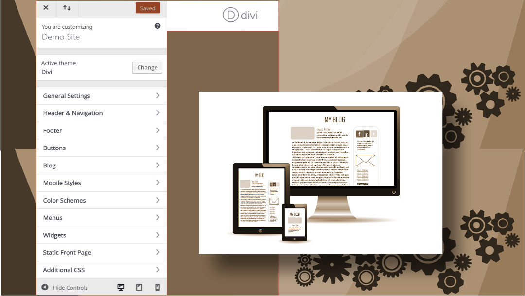
The way we build websites has changed. We can customize changes in real time as we select the option. In this post we’re going to look at the Theme Customizer for the Divi Theme. The Theme Customizer area is different from the Theme Options area.
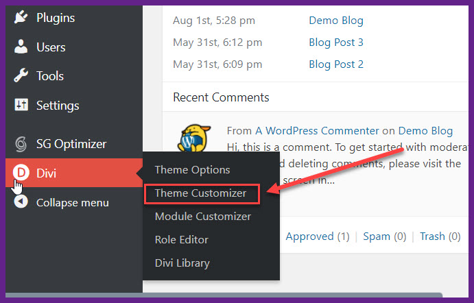
Locate the Theme Customizer from the WordPress Dashboard Menu, locate Divi and the pop out menu will give you three options.
You access the Theme Customizer area from the WordPress Dashboard Menu, locate Divi and the pop out out menu will give you three areas, Theme Options, Theme Customizer, Module Customizer, Role Editor, and Divi Library.
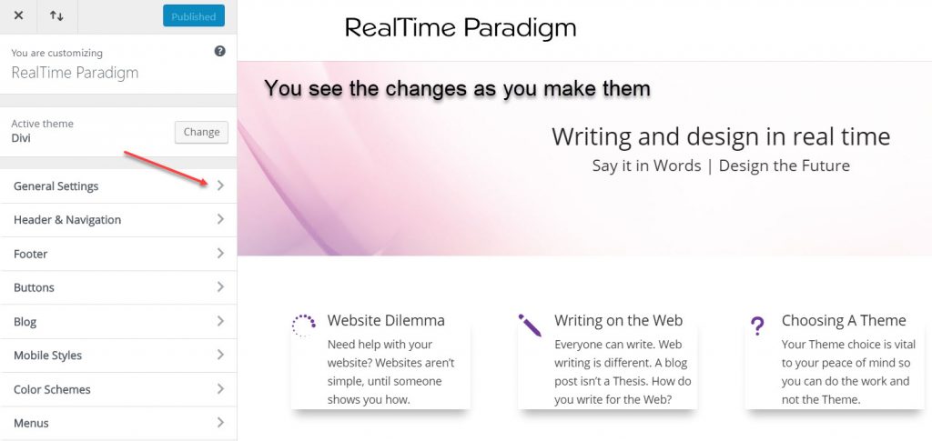
Select Theme Customizer and it will take you to the area where you can customize some of the settings. In this example we are looking at the website RealTime Paradigm using the Divi Theme.
On the right in this image is the Homepage. As you make the changes you are able to see them on the screen.
You have to be adventurous and click the bracket symbol >
As you do, it will show you the elements you can customize. When you Customize something, ideally, you are improving on a function. The Theme Customizer area is organized with options. At first it might seem overwhelming, if it is and you’re unsure of a setting, leave the setting at default. You can always return to the Theme Customize area to change something.
What Are You Customizing?
The main settings throughout the site. If you change the settings in the Theme Customizer area they happen throughout the whole site. This is known as a “global” setting. For example, if you change the Font style it will change the headings and the body font for all pages, projects and posts.
The Divi Theme has built in font options. If you want to change the font style there are six-hundred font styles to choose from. The font size on the web is not the same as it is in print. The standard web font size is 14 point. What you do want to check is the font color. Make sure it is not set too light so it is difficult to read. For example: this font is too light.
Too many choices at one time can end up as confusing. My advice after working with the Divi Theme since 2013, leave the font style and size at the default setting while you set the Header, Footer, and other elements. After the content is in the site, come to the Theme Customizer area and change the Font Style and color, globally.
Customizing the Header
The makers of the Divi Theme thought of every detail and there are options to choose. As you experiment with the settings, you will get a feel for what looks right for your website. There’s no perfect way to do anything. One thing you will find with the Divi Theme, it has the flexibility and you won’t run out of options.
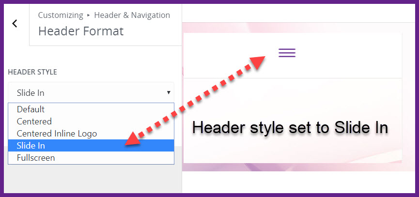
Here is an example of the Header Style set to slide in, also known as the “hamburger” menu. If you click on the lines, the menu will slide in from the right side, this is the Slide In Header Style.
In our example the Header Style is set to slide in – the “hamburger” menu.
You can see there are other options in the Header Style section.
The Divi Theme gives you the opportunity to change the settings, without having to know advanced coding. Try out the settings and see which one works for what you have in mind. Even if you don’t have a particular style in mind, you’ll find the options will help you choose which one works best for your website.
Now let’s look at what this style looks like in action with the Slide in active. While you’re in the Theme Customizer you can select the menu to see what it looks like. After clicking on the hamburger menu, the menu will slide in from the right to the left and this is what the Slide In Header Style looks like.
This is the Main Menu with the pages in a list format. It is convenient because it tells the viewer right away what pages are in your website. You can also put Projects, and Posts in the Main Menu. The ability to customize and arrange information gives you the advantage.
The background is set to purple and the menu items are white. You can style the menu color and the font size. Remember, whenever you increase the font size, be sure to check the different screen views. At the bottom of the Theme Customizer screen you will see a desktop, a tablet, and a mobile icon.
As you click on the icon the screen will change and you can see how the setting you just changed and the different screen sizes. The Divi Theme is fully responsive and adjusts automatically to the screen the site is viewed on.
Mobile View of header style slide in.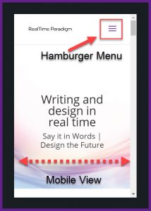
The Hamburger Menu shows up on the mobile screen. You are viewing the mobile screen inside the Theme Customizer area. You want the mobile screen to be visible to the viewer. The slide in hamburger icon has a compact view. The viewer can see they arrived at the correct site.
People are familiar with the three lines and will click on them to open the menu. Notice the width of the mobile view.
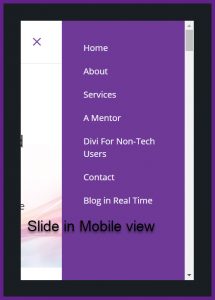
This is the view after clicking on the hamburger icon. The screen will slide out and the mobile viewer sees the main menu on their smartphone.
You are still in the Theme Customizer section viewing the Slide In Header Style. All the pages in the Main Menu on this site are visible. On the left you see the “X” symbol. This closes the mobile menu and takes you back to the Home Page.
If the mobile viewer doesn’t want to visit the pages from the hamburger menu, they will be able to see the pages of the site in the footer menu.
All these options are going to give you control over how your website looks. There are plenty of options with the Divi Theme. Go slowly, you don’t have to try out everything all at once.
The list of things you can customize is long.
You have to take the time to open the settings to see what they do. When i first started to use the Divi Theme I would open the settings and read them but didn’t implement the setting until I figured out if it was what I want. The next section we’re going to look at is the Mobile Styles.
Mobile Styles
This is an entire area of customization because we live inside our smartphone or tablet when we’re on the go. As you select Mobile Styles the screen will open up the three different areas.
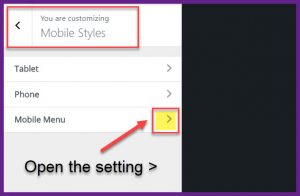 Here you can see the options the Tablet, Phone, and Mobile Menu. Open the setting and you’ll see the list of settings. If you’re not familiar with the sizes, leave the settings at default to begin with.
If you set the font too large it breaks over the width threshold. Click the > symbol and the Mobile Menu style options will open. Now you have to be creative, but don’t go overboard. Keep the colors simple and readable.
Why You Shouldn’t Customize Everything
A website needs a specific identity, or brand. When you use a color scheme you should set it throughout the site globally. One of the rules to remember is: just because you can doesn’t mean you should. The main purpose of a website is to communicate your message and provide information. You want people to access this information without confusion. If you style the color of your mobile menu so differently from the main website menu, the person viewing your site on their mobile screen, could think they’re no longer on your site.
Customize With Caution
The whole experience of websites is going to get easier as the builders of WordPress Themes bring their best quality work for you as the user. We’re fortunate to have readymade themes and something like the Divi Theme to work with. The one error you don’t want to make is over-customizing your website. This is easy to do because there are so many options, and you can have a website with your own unique style.
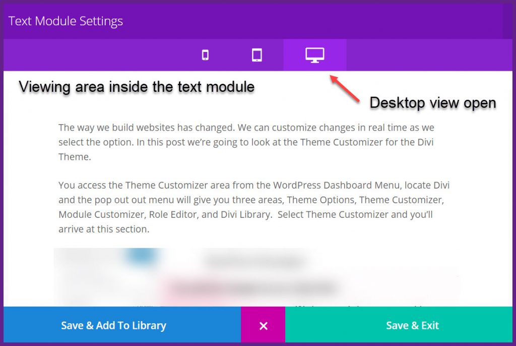
The Divi Theme gives you a rich experience in working with the content as you build your site. As you work in each page on your site, you’ll customize the settings from within the module itself on a given page, or blog post. Let’s look inside the Text Module settings viewing area.
This viewing area is in every module. Use this as you work in your website. It will show you the different widths and how the information is arranged on the various screens. When you come to the Theme Customizing area, you’ll be familiar with the different screen views. Use the Theme Customizer to do a final check after you’ve worked on the content in the site.
Some Points to Remember
- The Theme Customizer changes a setting globally (meaning throughout the site)
- The Module Customizing is for specific areas of content when you are working in a page or a post and only apply to that page
- The Theme Options disable or enable options for the theme to operate
Built In Customization
Customizing your own website might be intimidating. What if you were to find someone to do it for you? The customization is already built in, ready to use. Custom built websites can be expensive, but if you have a big idea with a small budget you can afford a Premade Template Package with customization already built in.
The Templates in this Marketplace are built on the Divi Page Builder framework by Elegant Themes. Divi is the most flexible WordPress framework for a website, it grows as your needs grow. As technology leaps ahead you need an experienced team who will give you the website and the service you want.
The Experienced Team at Monterey Premier
Geno Quiroz | Jerry Simmons | Dana Damato


There’s no perfect way to do this. Everyone works differently. The Divi Theme has a way of bringing out the best in people. You’re never alone when you use the Divi Theme. If you get stuck or need help join the Elegant Themes User Community. The Divi Theme lets you have your website your way.
Say it in words – design the future. When I’m not building websites in Divi, I’m writing about Divi. The most versatile, flexible theme, built for the user.

