In the vast digital world, your website is your ambassador, storefront, and first point of contact with customers. But having a sleek design or informative content is only half the battle.
Your website needs to do more than look good – it needs to compel action. This is where a website call to action, or CTA, comes in.
Website Call to Action: Your Ultimate Tool for Customer Engagement
A CTA is a statement designed to prompt an immediate response from the user. It’s the “Sign Up,” “Buy Now,” or “Learn More” that guides your visitors towards taking a desired action.
The importance of having a CTA on each page of your website cannot be overstated. It’s like a map guiding your visitors on the journey you want them to take, ensuring they don’t get lost along the way.
Benefits of a Website Call to Action

CTAs aren’t just flashy buttons or catchy phrases – they’re powerful tools that can provide immense benefits to your business. Let’s dive into some of them:
Encourages User Engagement
A call to action (CTA) enhances user engagement by prompting visitors on a website to take a specific action, such as signing up for a newsletter, downloading a resource, or making a purchase. It’s like a guide, transforming a passive browsing experience into an active one, encouraging visitors to engage more deeply with the site’s content or services.
Drives Conversions and Sales
By prompting visitors to take action, whether that’s purchasing a product, signing up for a newsletter, or contacting your business, CTAs help to convert passive visitors into active customers. This not only boosts your conversion rates and sales but also enhances the overall user experience, encouraging customers to engage more deeply with your brand.
Increases Lead Generation
A call to action can increase lead generation by encouraging website visitors to provide their contact information, usually in exchange for something valuable like a free resource, a discount, or access to exclusive content. By doing so, businesses can capture these leads – potential customers who have expressed interest in their product or service – and follow up with them later, thereby nurturing them down the sales funnel.
Builds Customer Loyalty and Trust
A call to action can build customer loyalty and trust by providing clear, transparent instructions and offers. When a business delivers on the promise made in the CTA – whether it’s a valuable resource, excellent customer service, or a reliable product – it builds trust with the user. Over time, this trust can translate into loyalty, with customers more likely to return to a business they feel is honest and reliable.
Elements of an Effective Call to Action
Creating an effective CTA isn’t just about the right words. It’s about combining those words with strategic placement, persuasive design, and enticing offers. Here’s what you need to consider:
Clear and Compelling Language
Using clear and compelling language in your call to action (CTA) is important because it guides users towards taking the desired action in a straightforward and enticing manner. Clear language removes any ambiguity about what the user should do next, while compelling language creates enthusiasm and motivates the user to click or engage, thereby increasing the effectiveness of the CTA.
Placement and Visibility on the Page
The placement and visibility of your call to action (CTA) on the page is crucial because it directly affects whether or not your visitors will see it and respond to it. A strategically placed CTA that’s easily visible will catch the user’s attention and is more likely to prompt them to take the desired action, be it signing up for a newsletter, making a purchase, or downloading a resource.
Use of Persuasive Design Elements
The use of persuasive design elements in your call to action (CTA) is important as it can significantly influence a user’s decision to click or engage. Elements like color, size, shape, and font can draw the user’s attention, make the CTA stand out on the page, and evoke emotions that encourage users to take the desired action. This marriage of aesthetics and functionality can greatly enhance the effectiveness of your CTA.
Relevant and Enticing Offers
Using relevant and enticing offers in your call to action (CTA) is essential because it provides a compelling reason for users to take the desired action. By offering something of value, whether it’s a discount, a free trial, or exclusive content, you’re not just asking for a click – you’re providing a beneficial exchange. This incentivizes the user to engage, making your CTA much more effective.
Keep it Concise and Specific
Your CTA should be short, sweet, and to the point. If a CTA is too long or vague, users might become confused about what they’re supposed to do next, which could lead to lower engagement. A concise and specific CTA, on the other hand, provides clear direction and reduces any potential friction, making it more likely that the user will take the desired action.
Use Action Verbs
Using action verbs in your CTAs is a best practice because these words inspire action and give clear instructions to the user. Verbs such as “Download,” “Sign Up,” or “Buy Now” directly tell the user what they should do next. This clarity reduces confusion and makes the CTA more effective in driving user engagement and conversions.
Create a Sense of Urgency
CTAs that create a sense of urgency, like “Limited time offer” or “Buy now before it’s gone”, often see higher conversion rates because it motivates users to act quickly. By implying that an offer is limited in time or quantity, you tap into a user’s fear of missing out (FOMO). This psychological trigger can significantly increase the likelihood of the user taking the desired action, thereby improving the effectiveness of your CTA.
Test and Optimize Your Call to Actions
What works for one website may not work for another. Regularly test and tweak your CTAs to find what resonates best with your audience.
Examples of Effective Website Calls to Action
Here are some examples of effective CTAs that have proven successful:
Proven CTA Prompts
“Sign up for our newsletter and receive a free e-book”: This CTA provides immediate value to the user, making it highly enticing.
“Get a free trial of our software”: By offering a risk-free trial, this CTA reduces the barrier to entry and encourages users to try the product.
“Buy now and get 20% off your first purchase”: This CTA creates a sense of urgency and provides a clear financial incentive.
“Schedule a consultation with our experts”: This CTA builds trust by offering access to industry experts, increasing the likelihood of conversion.
Real-Life Examples
Now that we understand the importance of CTAs, let’s dive into some real-life examples to see how businesses effectively utilize them:
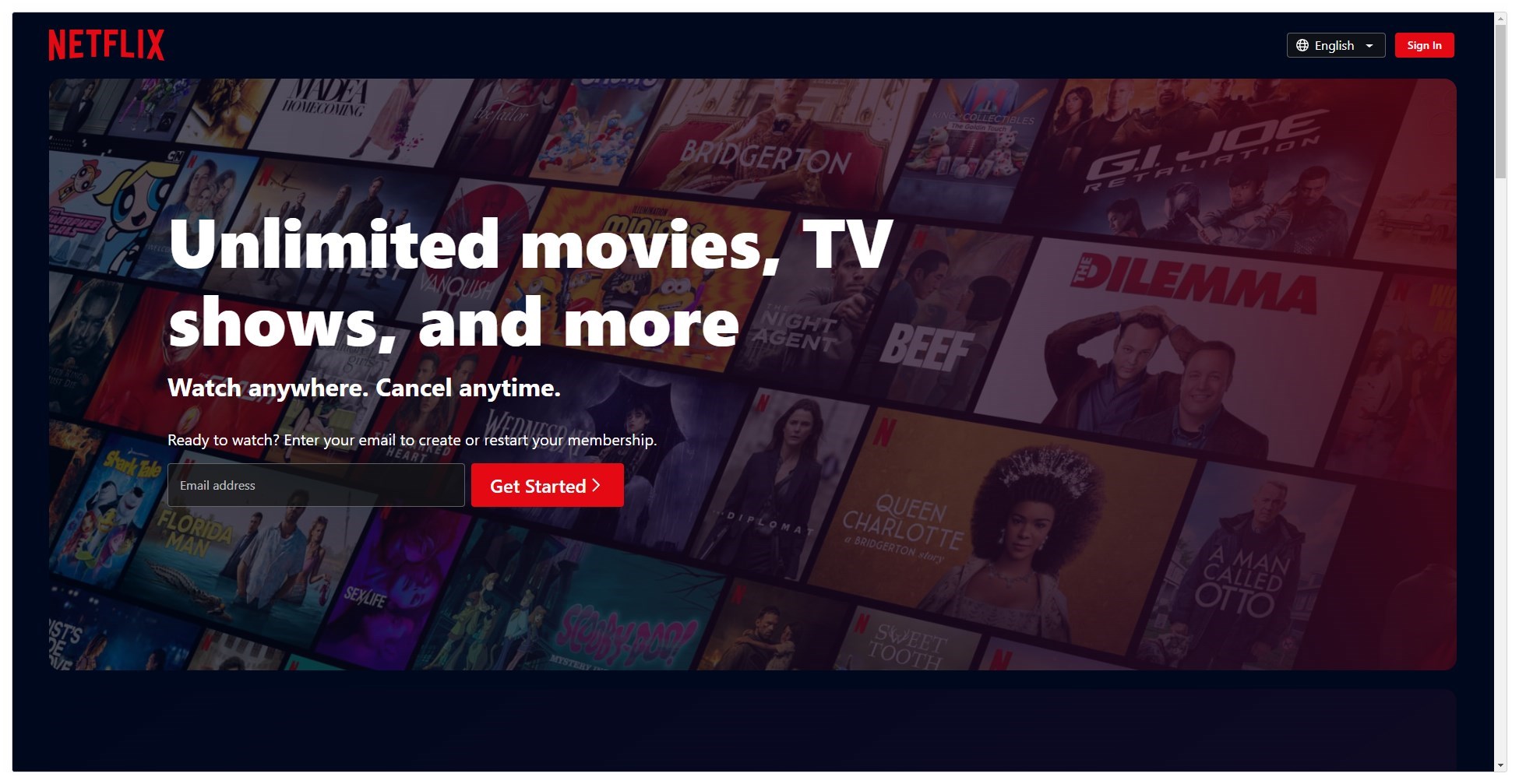
Netflix
Their CTA is simple and direct: “Sign Up Now”. It’s coupled with a secondary CTA: “Watch anywhere. Cancel anytime.” These CTAs together create a sense of urgency and ease, making it difficult to resist the offer.
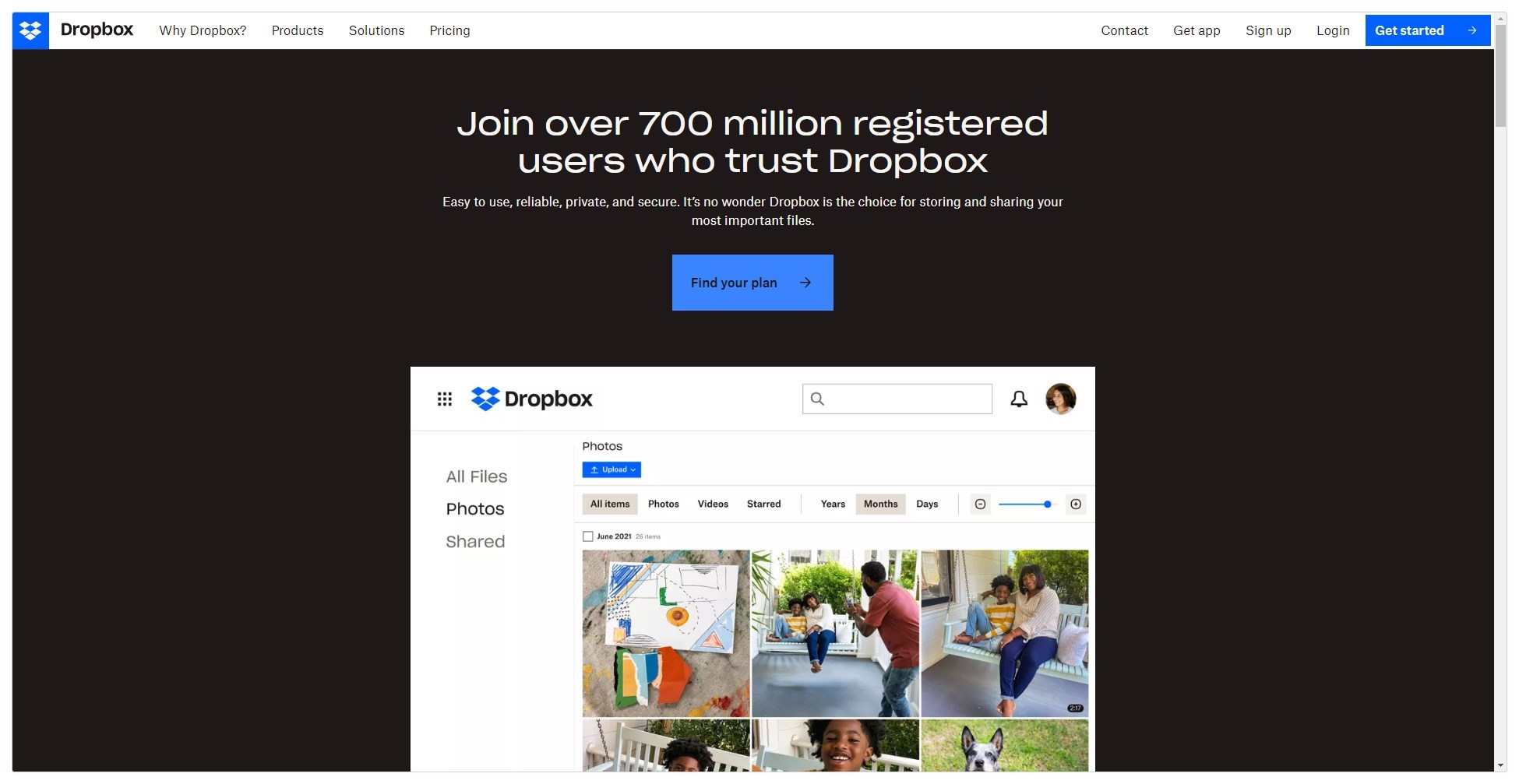
Dropbox
Dropbox uses a CTA that get’s people to the pricing page. Since most people know what Dropbox is, this approach gets right to the question most people have, how much does it cost.
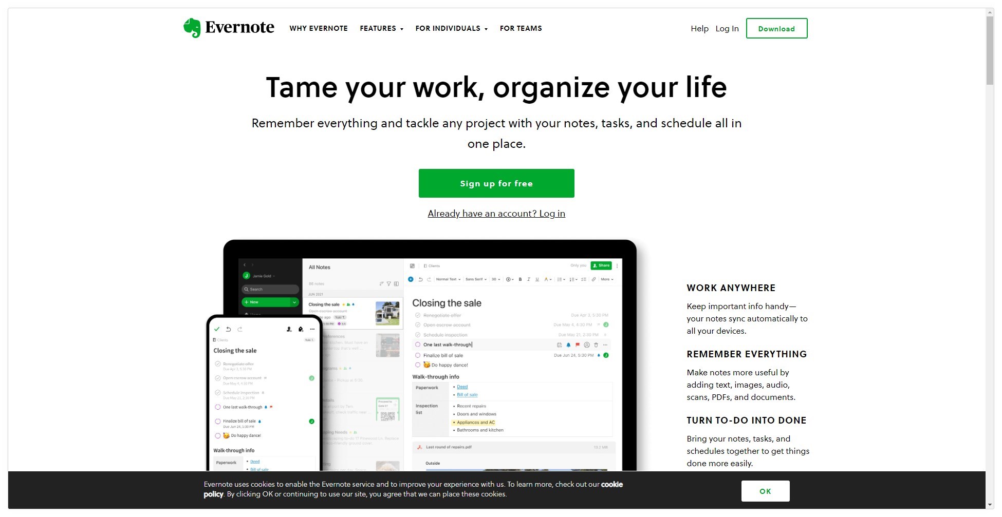
Evernote
Evernote’s CTA, “Sign Up for Free”, speaks directly to the user’s benefit. By highlighting that it’s free, Evernote mitigates any initial resistance, encouraging users to sign up.
Frequently Asked Questions about Website Calls to Action
What should a good call to action include?
A good CTA should be clear, concise, and create a sense of urgency. It should also guide the user towards the next step, whether that’s making a purchase, signing up for a newsletter, or downloading a resource.
Where should I place a call to action on my website?
The placement of a CTA can vary depending on your website’s design and goals. However, common placements include the header, end of blog posts, and pop-ups.
Can I have more than one call to action on a page?
Absolutely! You can have more than one CTA on a page, but be careful not to overwhelm your visitors. Each CTA should serve a clear purpose and guide the user through their journey on your site.
How often should I test my website’s call to action?
Testing should be an ongoing process. Regular testing can help you understand what works best for your audience and optimize your CTAs for better results.
Sealing the Deal: The Transformative Power of Website Calls to Action

In conclusion, a website call to action is a powerful tool in your digital marketing arsenal. It’s the guiding hand that leads your visitors along the customer journey, turning casual browsers into engaged users and, ultimately, loyal customers.
By creating clear, compelling CTAs and placing them strategically throughout your site, you can drive engagement, boost conversions, and foster customer loyalty.
So remember, in the world of websites, it’s not just what you say, but how you invite your visitors to respond that can make all the difference.
Geno Quiroz serves on the Marketing & Technology team at IPX1031, a Fidelity National Financial company and a national leader in 1031 tax-deferred exchange services. In his current role, Geno focuses on website architecture, design, development, SEO/AIO, and digital marketing strategy. His work helps strengthen the company’s digital presence, improve user experience, and ensure that IPX1031’s online platforms effectively support client engagement and long-term growth.
Concurrently, Geno continues to lead Monterey Premier, the web design and strategic consulting firm he founded in 2015. Through Monterey Premier, he partners with entrepreneurs, nonprofits, and growing organizations to design high-performance websites, refine digital sales funnels, and implement conversion-focused strategies.
His hands-on experience building and scaling a client-facing agency has provided him with a real-world understanding of growth strategy, brand positioning, and the operational realities of business ownership — experience that now directly informs and strengthens his work in enterprise marketing technology.


