More businesses went online in 2020 due to social distancing and people staying home.
The best way to reach customers during a pandemic is through online sales. With so many people shopping online and stores stepping up their e-commerce efforts, there are new things to consider in 2021 to make your site remarkable and effective.
In a report by eMarketer, experts estimate worldwide retail e-commerce grew 27.6% in 2020 to $4.28 trillion. The world of online shopping is growing and isn’t likely to slow anytime soon.
There are a few things that make some sites stand out from others. Implement these tips for a stellar design that keeps customers coming back. What makes a great e-commerce site?
1. Offer Unique Products
Just about anything you want to buy can be found online. You must think of products or services no one else offers, or ways to customize what’s out there. If you plan to sell tumblers, offer customization options such as adding the person’s name. Look for ways to be different than competitors.
Spend time studying your competition. How can you do something different or better? Think about what your customers want and need. You should be the one who taps into their wants better than any other company around.
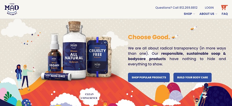
For example, there are hundreds of handmade soap companies available, but The Mad Optimist stands out because they allow you to customize your products by choosing ingredients and building the perfect mix for you. They also outshine by offering sustainable materials and ingredients.
2. Consider Navigation
People are accustomed to the navigational hierarchy being in a set order and location on websites. There is either a hamburger menu near the top of the page or a navigation bar with a contact button to the right and a home button to the left.
It’s probably best not to stray too far from the norm with your navigation. You want users to feel your site is easy to use and intuitive. Save the unique elements for products and offers. Make sure any navigation adapts to mobile devices.
You have mere seconds to make a first impression. About 55% of our opinion of a brand is based on what we see.
3. Provide Transparency
According to a consumer survey, around 66% of customers believe transparency is one of the most important elements in how much they trust a brand. Look for ways to be upfront about your product.
List the benefits, but don’t just gloss over any of the additional information. People need to feel they can trust you to become loyal to your brand.
If you’ve run into any problems in the past, be upfront about those mistakes. Tell your leads what you’ve done to fix issues and how you’ll do better going forward. People understand businesses go through growing pains. They just want you to learn and provide them with an excellent experience.
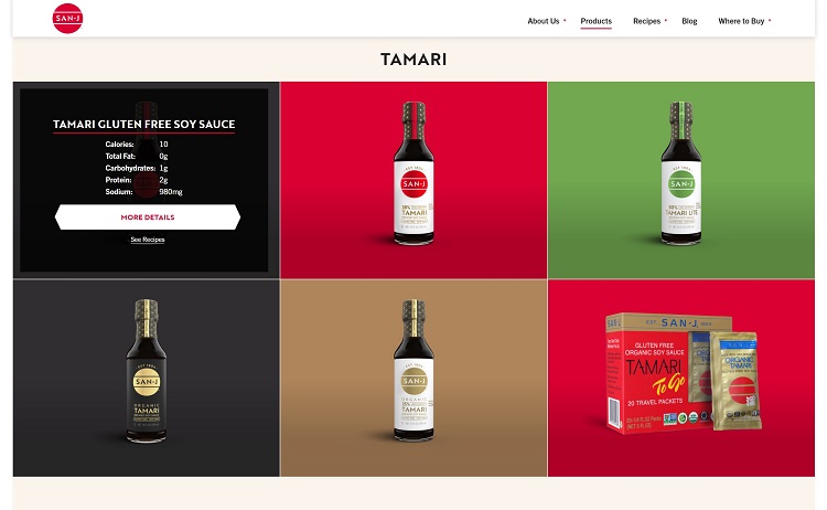
San-J uses animated mouse-overs to share the details of each product on their e-commerce site. When you move your cursor over an image of one of their sauces, you see a nutrition label sharing basic info such as calories and sodium. You can click on a call to action (CTA) to get further details, such as ingredients.
4. Engage Site Visitors
When someone lands on your page, how do you draw them in? You can use interactive elements, such as arrows encouraging them to scroll down or click. Add a video explaining your product or offering valuable advice.
Look for ways to get your site visitors participating in going through the buyer’s journey. The more engaged they are, the more likely they’ll hang around long enough to buy something.
Use animation, get them to click on videos and links, and find ways to move them through your landing pages to the next step in the sales funnel.
Use strong, active verbs to drive the user where you want them to go. Around 94% of CTAs use action verbs such as “start” and “learn.”
5. Share Valuable Content
Content is the machine driving people to your e-commerce website in the first place. You must know your target audience and the information they need to solve their pain points. If you aren’t sure, survey your current customers and ask what would help them the most.
You’ve probably heard the saying that “content is king.” In some ways, this is still true. You can use articles to engage users on social media and drive traffic to your pages. You can add videos to tell a story. Content helps you rank better on search engine results pages and gives visitors another way to connect with your brand.
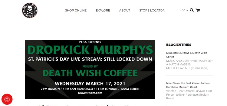
Death Wish Coffee runs a blog covering news about their brand, interesting tidbits, and fun facts. Each piece ties into their brand and product in some way. The blog is entertaining, but it also enhances their name recognition by linking musicians and other local celebrities.
6. Improve the Checkout Process
Cart abandonment is an issue for any e-commerce store. You can improve your numbers simply by making your checkout process simpler. Remove any unnecessary steps. Take the time to go through the process yourself and look for issues.
Think about how many of your customers access your site via mobile devices. How can you make checkout easier for them so they don’t have to type out their information on a tiny on-screen keyboard? Adding the capability to use Facebook or Google accounts is just one option.
Final Thoughts
There are many factors that make up a great e-commerce site in 2021. Consumers buy online more frequently and expect more out of brands than ever before. Pay attention to the little details. Spend time looking over your e-commerce pages and perfecting every aspect until your conversion rates are where you want them.
Featured Image Credit: Pexels.com
Eleanor Hecks is editor-in-chief at Designerly Magazine. She was the director at a marketing agency before becoming a freelance web designer. Eleanor lives in Philadelphia with her husband and dog, Bear.


