WordPress and the Divi Theme
WordPress has become synonymous with a website. It is the software built with the user in mind for the non-tech person and the developer. WordPress is fast, secure, and regularly updated. It is an open source project and developers from all over the world contribute to the core code.
WordPress was started in 2003 as a project, a “fork” form a web log communications tool called b2 cafelog. A developer named Matt Mullenweg wanted to improve the communications software and asked in the forum if someone was interested in building out a fork of the software. David Little responded and the result was a team of people and the initial WordPress blogging software was created.
Today it is more than a blogging software, it’s the software of choice for 27% of websites worldwide.
The language of the web is code and WordPress uses the metaphor; code is poetry. It is the “writing” of the website. Just as an author writes a book, a developer is the poet of code.
WordPress is driven by a Theme which overlays the core code. Designers and Developers extend WordPress and create themes to suit any project with style.
Designing A Theme
The mechanics of designing a website must keep pace with technology improvements. It’s not often the “poetry” of a theme speaks to the developer, the designer, and the user.
When the technology within a framework embraces the creativity of everyone who uses it then you have an ideal combination for the creation of a WordPress website.
The Divi Theme is such a theme. Since it came out in 2012 designed by Nick Roach and the Elegant Themes team, it has changed the way we build websites. It is now the one of the most used themes in the world.
The Divi Theme
The theme is easy enough for beginners, and flexible enough for designers and developers to create masterful websites.
The working elements of Divi is comprised of pre-designed modules used with table frames for a web page layout. The web page has dividers and sections known as a “div” or divider section.
The Divi theme framework has a an array of preset modules for use on a specific page, project, or blog post. This theme is so flexible you don’t have to know code to build a website with Divi.
The Layout of Content
Some say you must design first and then put the content into the design. Which came first the chicken or the egg? Neither, both compliment each other. The one cannot happen without the other. Design and content have a vital relationship to each other.
The challenge with a website is the balance of the user and the escalation of technology. The code drives the moving parts of the Internet.
The Divi Theme captures the moving parts into the premade layouts and modules. All the code is built in. You can add code for a specific effect, but often the design of the module is so complete the most you are doing is changing the font, the color or adding an image.
Inside the Divi framework is the Divi Builder. This enhances the ability to go beyond a standard two column blog layout with options to use premade layouts and modules.
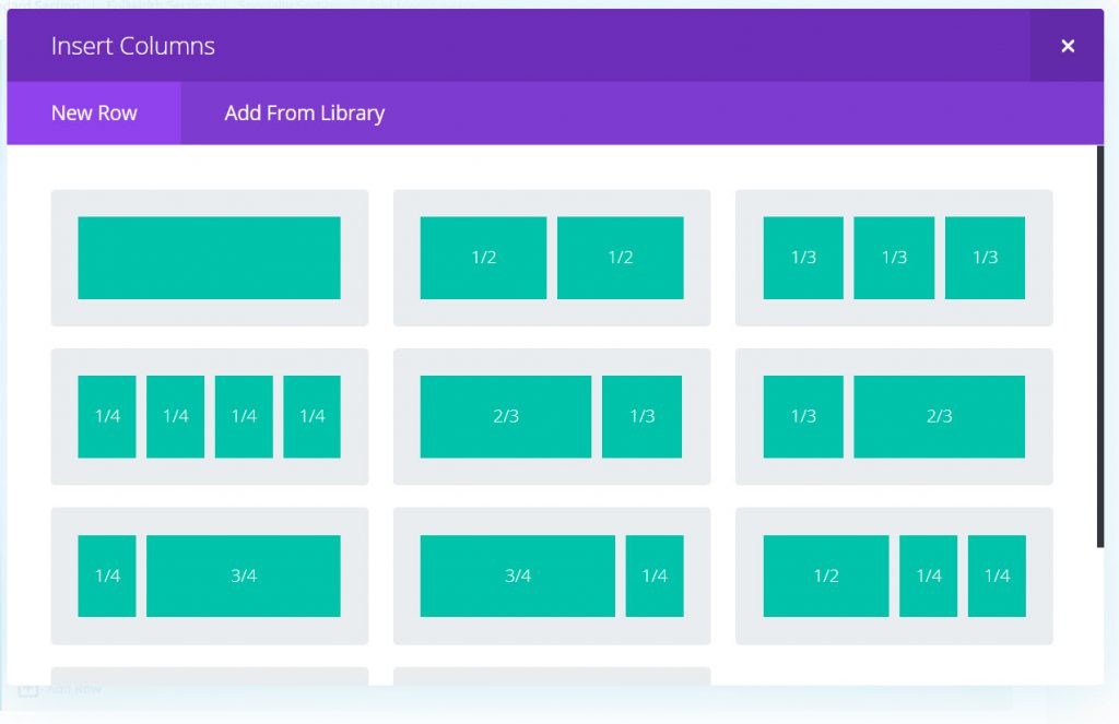
Here’s a view of the standard layouts within Divi when you use the Divi Builder.
The web page is divided into these tables. The tables are a placeholder for the modules. For example, you can select the 3/4 and 1/4 width from the column selection.
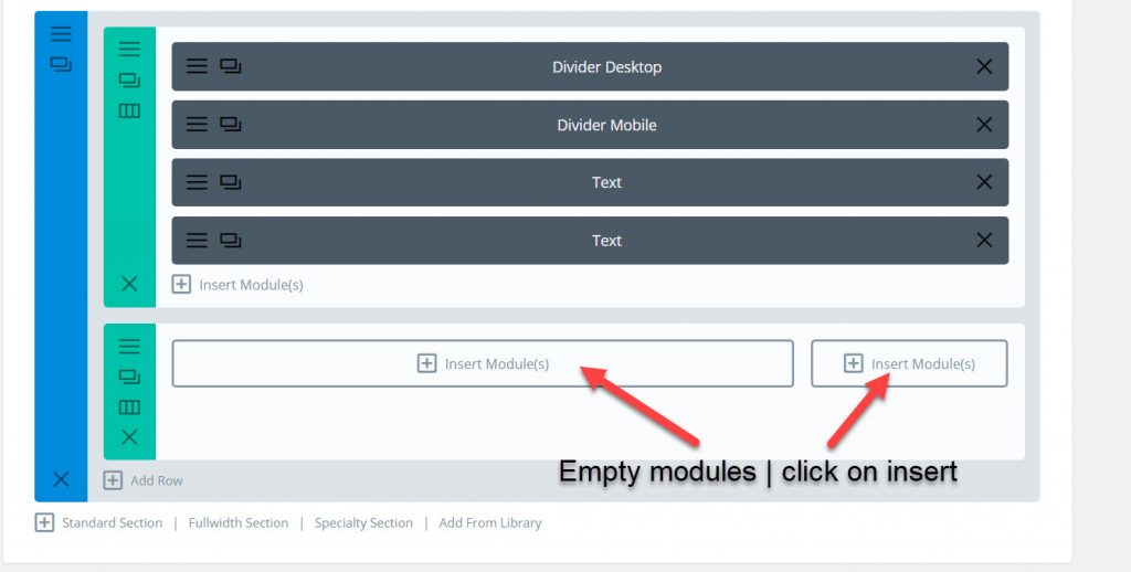
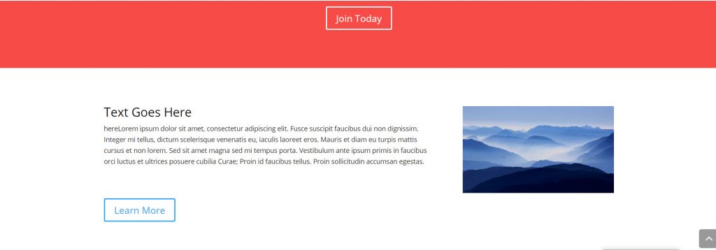
Let’s say you want text on the left and the image on the right.
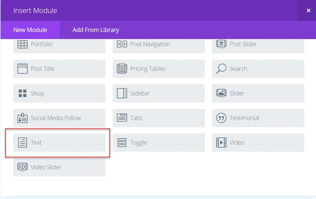
When you click on insert module look for the text module and select it.
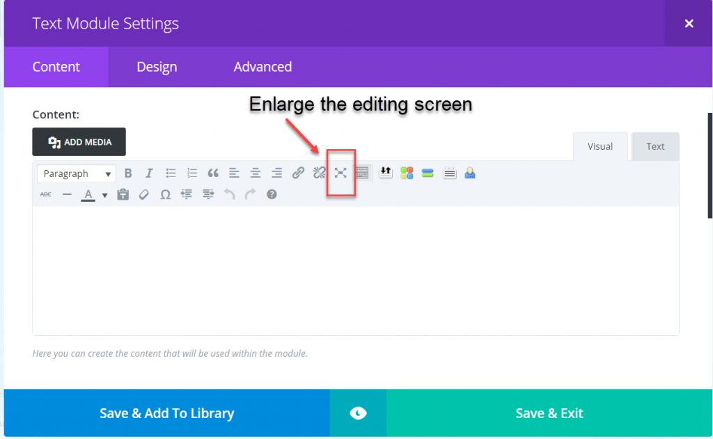
This is what the open text module looks like. For better viewing space, enlarge the editing screen.
Use the icons to see how they work. There’s nothing you do that will damage the site. You’re modifying a specific area of the page inside the text module. You’re using the visual image tab. This is the WYSIWYG (what you see is what you get), as you type you see the content without the code tags. The code is automatically generated in the Text (code) screen.
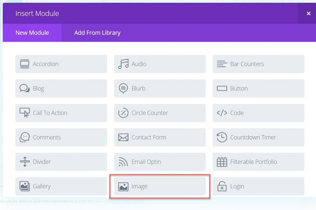
Now let’s look at an image module because we want to place the image on the right in the row we selected.
The entire spectrum of modules in Divi gives you different options to use on the page. This screenshot only shows the top half of the selection of modules. Divi has all the options contained in the modules. All you have to do is select which module you want to use.
Originally the example selected the 2/3 and 1/3 column width. This wasn’t what was intended so how do you change the row settings.
This is how the two column width looks with the content in the modules. Something to note here. No change was made to the existing content of text and image. Only the row setting changed. Once the row setting works then you change the content as desired.
This column layout doesn’t work. It’s not quite right. A half width alternating image and text would be better. Let’s change the column width.
Change Row Structure click on the icon and the column layout setting will open. Now you have to choose a different layout. Don’t worry about the content in the module, you’ll see what it looks like after you’ve selected another layout.If we want to change the layout of the column. Click on the icon and the layout module will give a choice of columns.
Select the two column layout.
As you can see, the modules in the columns were rearranged into a two column width. The text is still on the left and the image on the right. To get the alternative image effect in two rows duplicate the layout in the row setting.
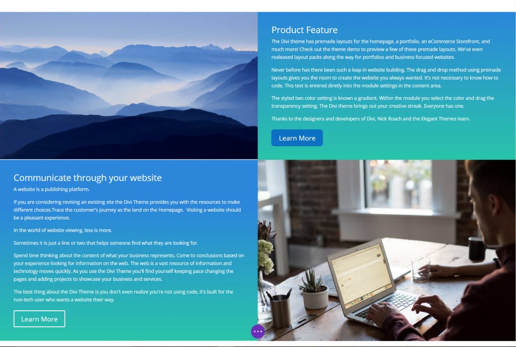
Here’s the built out alternating text and image. Within each module there is an advanced section where you can change the width of the column, and the background colors.
The effect of the two color background is a gradient selection. this was styled filling in the pixel setting inside the module.
The design and layout looks good on the desktop. Always check to see what it looks like on the mobile screen.
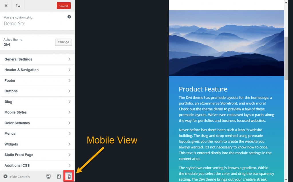
Go to the Theme Customizer section and look at the bottom of the screen for the desktop, tablet and mobile phone icons.
Click on the mobile icon. Divi stacks the modules for mobile view.
If it doesn’t look good, change it. The Divi theme is fully responsive and will adjust to the size of the screen. This picture is inside the Theme Customizer sections. You can see the desktop and the tablet view as you click on the icon.
As you can see Divi has options.
This is why it’s the theme everyone is talking about and making one of a kind pre-designed themes with Divi.
Website building has a new look and it’s through WordPress and the Divi Theme you’ll be able to have the website you always wanted. The Divi Theme has also brought people together. If you don’t know how to do something you can join the Divi Community Facebook group with other Divi users. When something of this nature brings people together it accomplishes more than just a great website.
Say it in words – design the future. When I’m not building websites in Divi, I’m writing about Divi. The most versatile, flexible theme, built for the user.

