The content people can find on your blog should be the thing that draws them to your domain. They might be interested in the topics you write about but once they open a page and read the text, they are likely not to come back to your blog because of other texts but because of the visual appeal.
Yes, a blog is not only about words and the message they convey but about visual elements that have the potential to make or break a blogger’s career.
If they fail to discover their unique visual style, bloggers will soon become dull, regardless of the topics they cover. Being original means that people will start following you and they are not going to follow a blog that uses black Times New Roman letter against a white background.
The color scheme used in a blog and the pictures that appear as visitors scroll down to read more are deciding factors when it comes to increasing the number of visitors.
A picture is worth a thousand words
Perhaps the most important visual element of any blog are images that go with the text. Ask any journalist and they will tell you how careful the editors choose images that will go with articles they write. Things are not much different in cyberspace, as a wrong picture could deter potential readers.
When used as backgrounds, pictures also become trademark of that particular blog if it doesn’t have a logo of its own and most blogs don’t. Few people will admit this but a large number of visitors just get hooked on the color scheme or the images on the blog and that is why they bookmark it and visit it every week.
The more images a blog post has the more likes, shares, and comments it will have. Images become the main carriers of messages as they evoke feelings better than words. It is easier for the readership to relate to an image as the representation of the point made by the text than the title. In fact, titles can be bulky and off-topic sometimes, while images catch the essence of the post perfectly.
The saying that a picture is worth a thousand words get a quite literal meaning in the blogosphere.
Outsourcing imagery
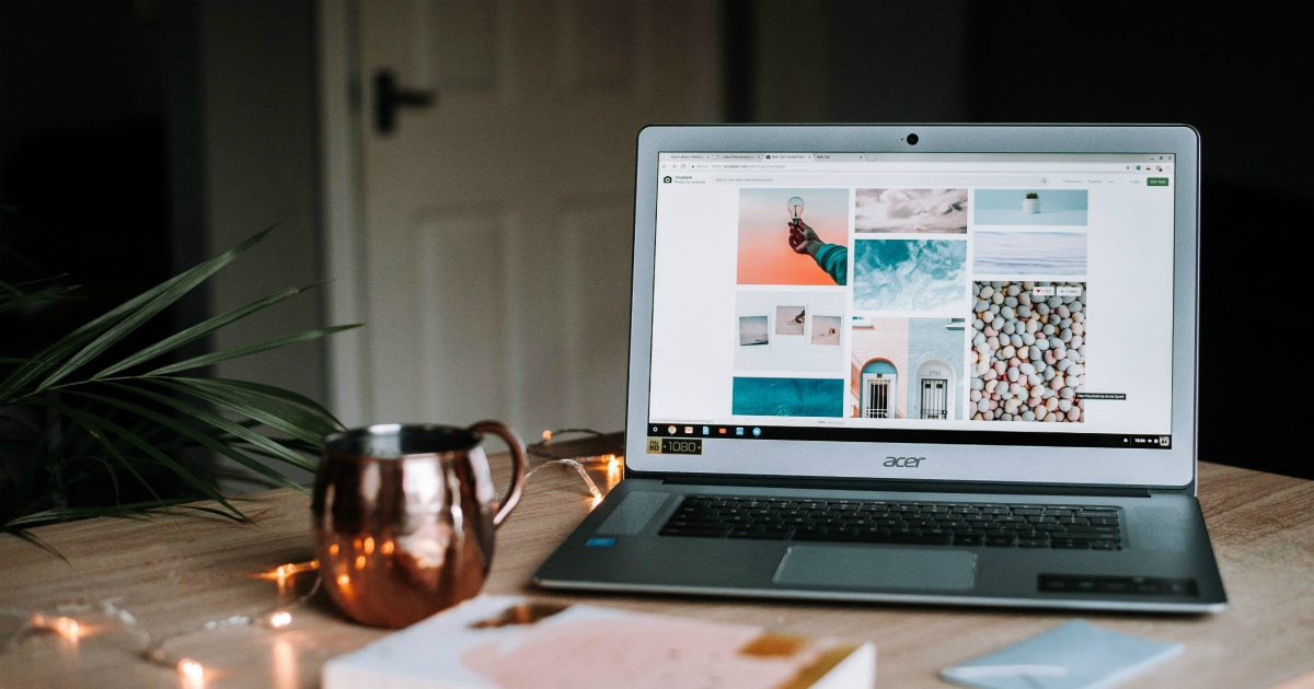
image credit: https://unsplash.com/photos/W1B2LpQOBxA
Having explained how important images are, you need to select them carefully. The biggest mistake novice bloggers make is posting overused, cliché, and generic images. They are not going to draw a crowd and it would be futile to make a separate photo session for every single blog post.
This is where IT savvy bloggers will shine, as they know that searching platform such as We Heart It, Pinterest, or Sleek Lens yields best results. Their biggest advantage is not a huge pool of photos, Google search has got you covered for quantity, but rather a huge selection of unique, original, and good quality images from different sources.
Both amateurs with their mobile phone cameras and professionals alike post here, so you will have an easy choice finding your style with so many one of a kind images to choose from. Especially interesting is the newcomer Sleek Lens which specializes in the field of professional photography, a feature that separates them from the bunch.
Even if a professional photographer’s picture is aesthetically lacking, you can always count on the image quality and its high resolution.
Attention grabbers
You as the blog owners could have all the statistics in the world but there is no way of telling why a certain person decided to click on the link to your blog. It could be that they were curious, bored or they needed material for their school project.
Whatever the reason behind reading your blog is, once they open the homepage, you want to grab visitor’ attention and keep them there as long as possible. The text will not be your ally in this effort, no matter how big or unusual the font is.
Like we said earlier, compelling images are your best shot of making people stay longer at your blog but visual representations, such as charts and diagrams can do a pretty good job too. For instance, if you write about the level of obesity in schoolchildren, you could have a graph showing which decade the population of obese children took off.
Such “shocking” spikes are the visual tools that will draw the reader’s attention to the text and then the facts and your style of writing will do the rest. Words and numbers you quote or refer to in the text might as well be non-existent if they are not represented in a graphic way.
The power of social media
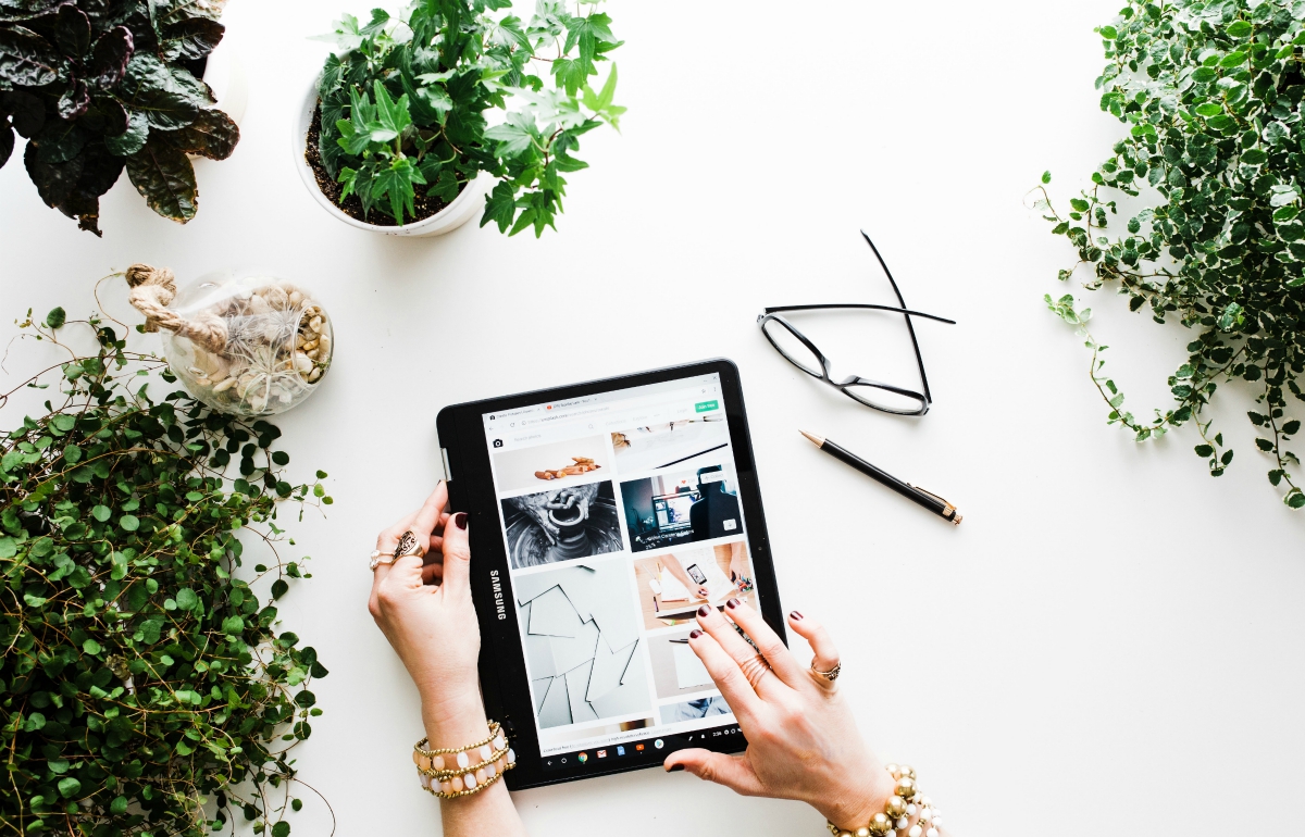
image credit: https://unsplash.com/photos/5pJPhkS6Oxg
Most bloggers are aware of the power of social media and they do put links to their private or professional profiles on various social media platforms. However, these usually end up at the bottom or in the corner of the page, as if you are trying to push them away from plans for a unique visual identity. T
he reality is a preview of the images you post on Instagram, of your Facebook posts and links shared, as well as any instructional videos you might have on YouTube, should be incorporated into the overall visual theme of your blog. They can make a ribbon on the right or left side from the main body of text, so they are always a click away. By following you on social media, your one-off reader becomes your subscriber.
Final thoughts
We hope that by now you realize the true power visual elements have in any blog. That is why you should choose the imagery carefully and go graphic all the way!
Featured image credit: https://unsplash.com/photos/zwsHjakE_iI
Stella is a graphic designer and illustrator, a lifestyle blogger and a food enthusiast. She is very passionate about the environment and her hobbies center around her love for nature, yoga and living in balance.


