When it comes to websites and what to do about them technology improves all the time. But it can be intimidating. You need a silent technology partner, always there when you need it. Is there such a partner? There is. It’s not a person, it’s the built in Divi Builder inside the Divi Theme.
It’s the new way to work. The silent technology partner with you every step of the way as you build a website with the Divi Builder.
The Divi Theme was developed in 2013 by Nick Roach the CEO of Elegant Themes and their design team. They just nominated you to build a website. You might be thinking this isn’t what you do. Websites are designed and developed by tech savvy people.
The builder of Divi had the non-tech person in mind when he created the theme. His love of design and elegance, with WordPress, led him to want to share the building process with anyone who uses the Divi Theme. As you work with the Divi Builder you’ll find the developer and the designer are right there with you. They have thought of everything you need to arrange the content on the page.
You don’t have to know how to code
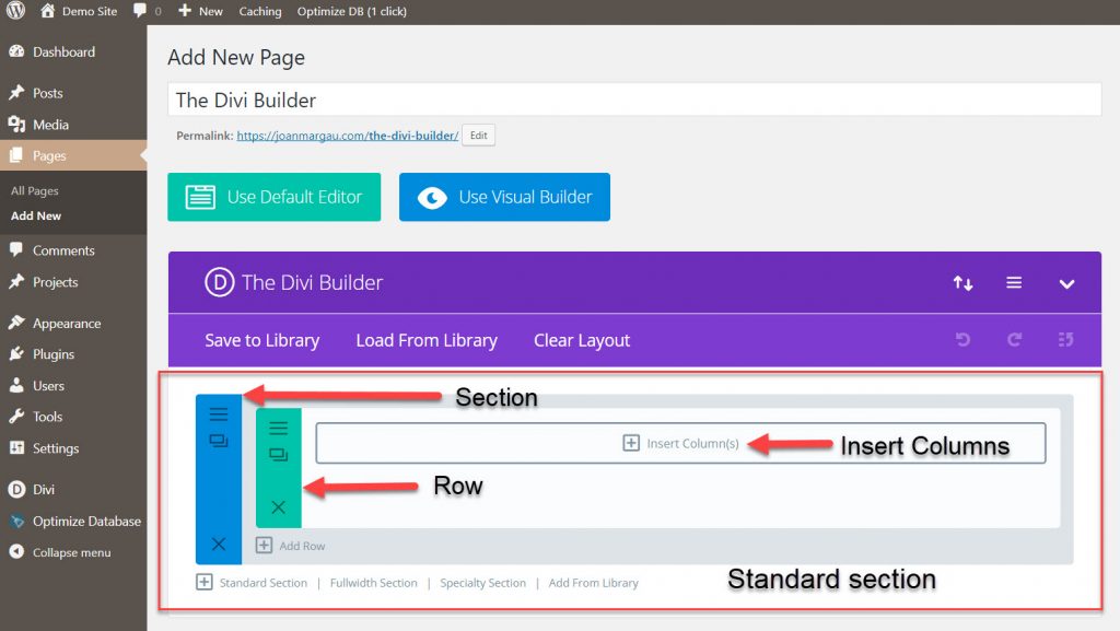
This is how I first started using the Divi Theme. I was delighted to find something already designed with the correct measurements and column widths. All I had to do was put the content into the right module. When you add a new page you must open the Divi Builder to use it. When you open the Divi Builder this is what you see.
A standard section opens. The builder is structured with color code sections for easy reference. The blue color is the section, the green is the row, and the modules are black. Now to figure out what to put on the page.
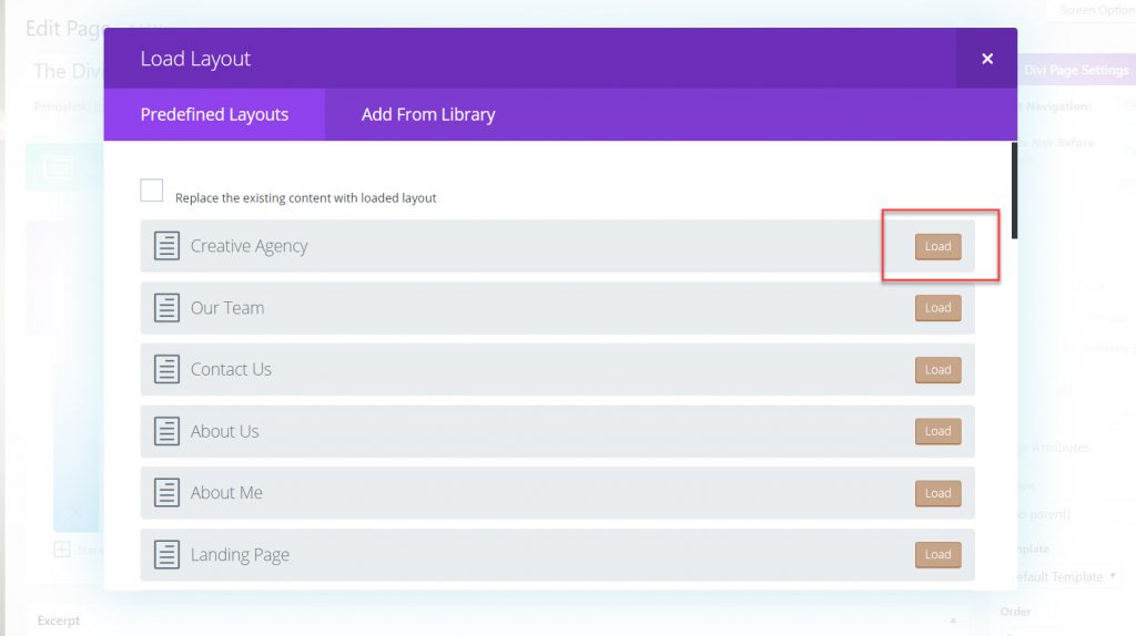
Instead of staring at a blank page and wondering how to layout the design of the page, the Divi Builder Library has 32 predefined layouts. To see the premade layouts select Load From Library. The library will layouts selection will open. The list is so long in this image we’re only looking at six layouts.
On the left is the list of choices and on the right is where you load the layout into the Divi Builder. In this article we’re going to look at the Homepage Basic Layout. The layout is basic as you’re just starting to build the website. As you become familiar with all the different settings in the design section of the module you’ll be able to experiment with different effects built into the module.
Homepage Basic Layout
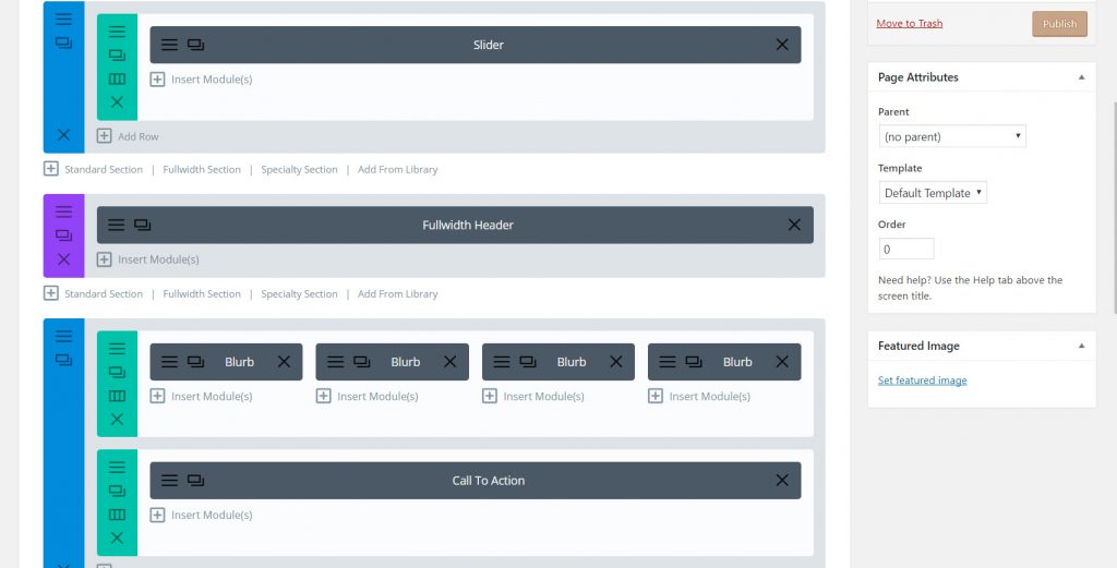
This is the Homepage Basic Layout we just loaded. You’ll see the color coded sections with the modules in the various rows and column width.
Notice the blue and green sections and one other section, purple. The blue and green represent the standard section. The purple is the fullwidth section. All the sections are the placeholders for the modules. The modules are black and labelled according to their function.
In this image we have a Slider, a Fullwidth Header, Blurbs, and a Call to Action.
- The Slider holds images, text, and a colored background.
- The Fullwidth Header can have image and text
- The Blurbs hold text: a short piece of information with the option to add an icon on top or the left of the Blurb.
- Call to Action this is where you put a link to another page to invite someone to contact you, or join your membership.
The Blurbs are in a four column width layout. All the widths are present and based on the grid system. We are looking at the edit section of the page. Let’s look at what this looks like after putting some information into the modules. Because a web page is longer than a regular page we’ll look at the slider first.
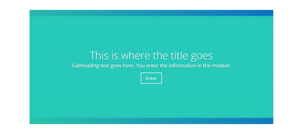
This is the slider module. The border of the slider is a gradient color set with green and blue. You can modify the background color using a gradient or solid color. The slider also holds an image. When you put text into the header it overlays the image or colored background.
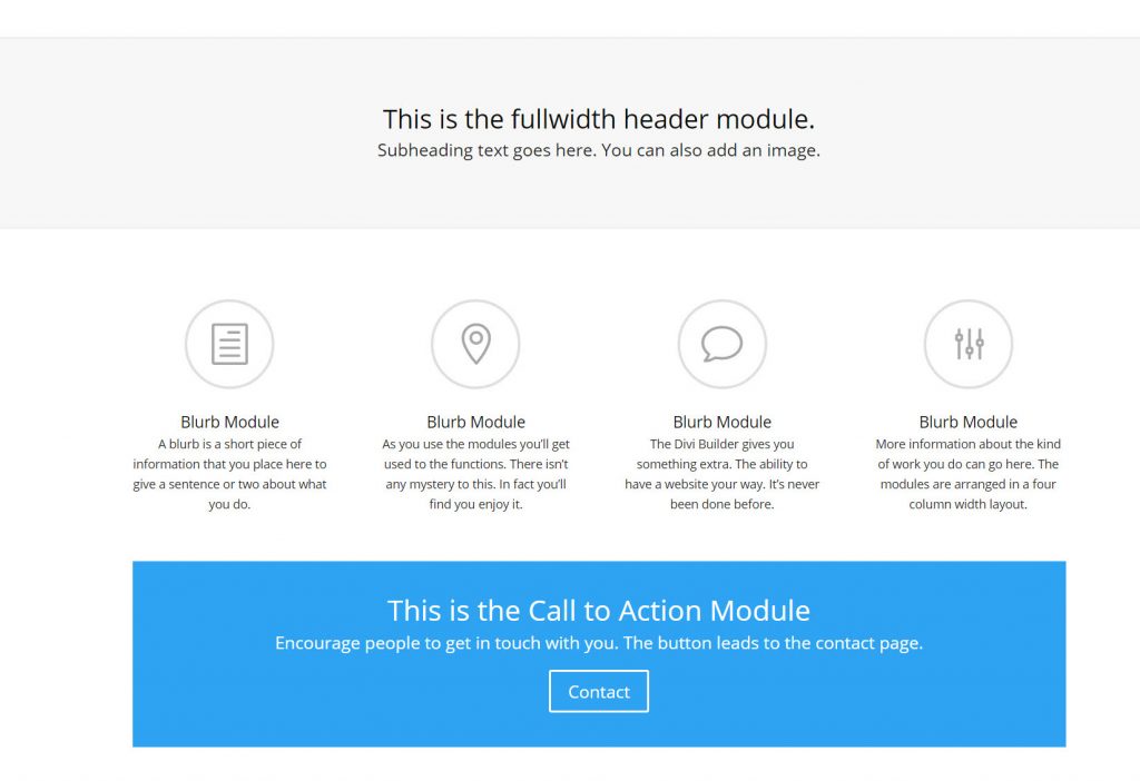
The next section on our page is the Fullwidth Header. This is the section identified with the purple color and goes across the full length of the web page. It can also be styled with colors in this image it is a soft grey only to highlight the text. We could call it a banner heading as well.
Underneath the header are the four blurb modules. They have an image icon set on top. Then there is the call to action module.
This is a new way of building websites. It’s the best news for everyone and ideal for the user the one who has the most fun experimenting with the design settings.
Inside the Module Settings
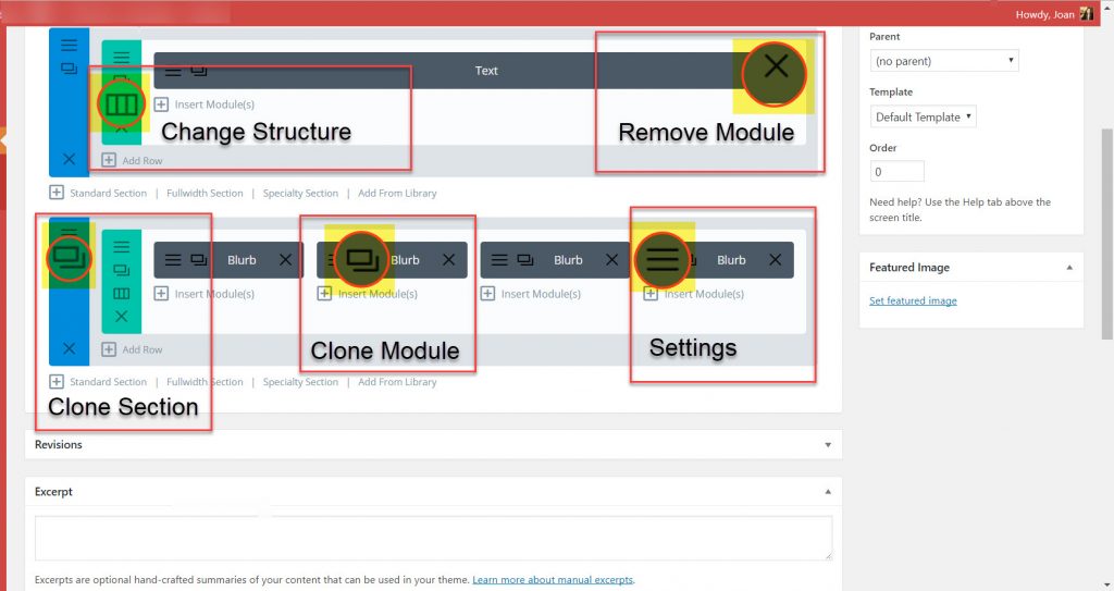
To do this we must go back to the editing view. Each row and module has a three line icon. When you place your cursor over the three lines the tooltip will show “settings.” This is where you adjust the settings for the rows, the sections, and the modules.
Let’s look at the details of the section settings. Once you identify the icons and what they do you’ll be able to use them because as always with the Divi Builder, the commands and settings are easy to recognize.
The Row Settings Icon lets you change the structure of the row layout. Let’s say you have your content in a fullwidth layout but want to have an image next to the text in another column. The change structure icon lets you change the column layout without having to redo the content. The content is inside the module. This is the beauty about the Divi Builder, it lets you do the building.
The X in the section or the row will remove the entire section or row.
The X in the module removes only the module.
Now let’s get into the Blurb Module Itself
Blurb Module Settings
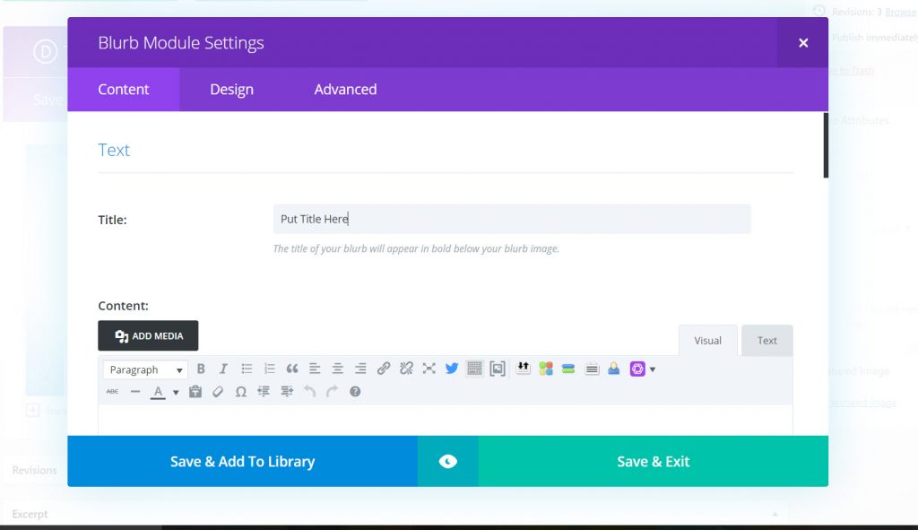
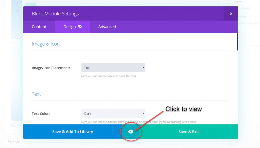
You will see Content, Design, and Advanced tabs. We’re going to look at the Content and the Design.
The Content is where you enter the text for the blurb. Our blurb is in a four column row. Keep in mind the width of the columns so you don’t load in too much text. A Blurb should contain a sentence or two. As with any module you’ll see the icon tools you can use. As I mentioned don’t go overboard with the blurb module, it looks like the interior of a text module but you have a limited width you’re working with in this four column layout with the blurb module.
The Design section is where you can set a small image or use the built in icon. An icon is a picture that doesn’t need a whole lot of words. Each setting has instructions. The image is placed on the top or the left. You can add a background and lighten the text for a specific effect. You just have to open the settings and begin experimenting with the options.
Notice the icon in the center between Save & Add To Library and Save & Exit. This is an area that is often overlooked and it gives you a view of the desktop, tablet, and mobile view. Let’s take a look at what what the Blurb module looks like without the icon on top. It’s a good idea to view the text and see how it looks in the four width column mode first.
The Module Viewing Area
You hear a lot about the mobile view, and responsive themes. Is the theme responsive? Here’s proof. Divi is 100% responsive.
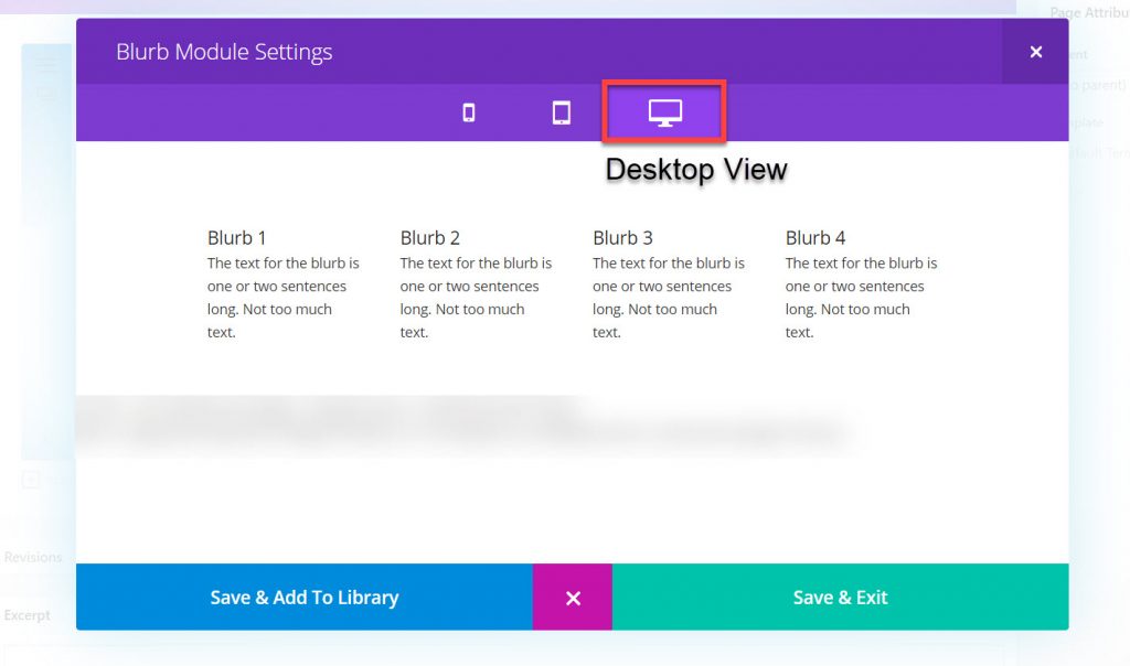
Our first view is what does the page look like on the Desktop. Most of your work will be on a desktop computer. Always get in the habit of checking the viewing area as you build the web page. You are viewing the specific screen before you Save & Exit the module and preview the entire page.
Desktop View
Here you can see the four Blurbs and what they look like. The text matches in length for a uniform length, but the topics covered in the four Blurbs will need to be edited and refined so the layout of the words fits into the context. That’s another Divi Builder feature, you’re now concentrating on the content which is more important than the design. The reader is looking for information you have, you don’t want them to be distracted by too much design.
The Tablet View
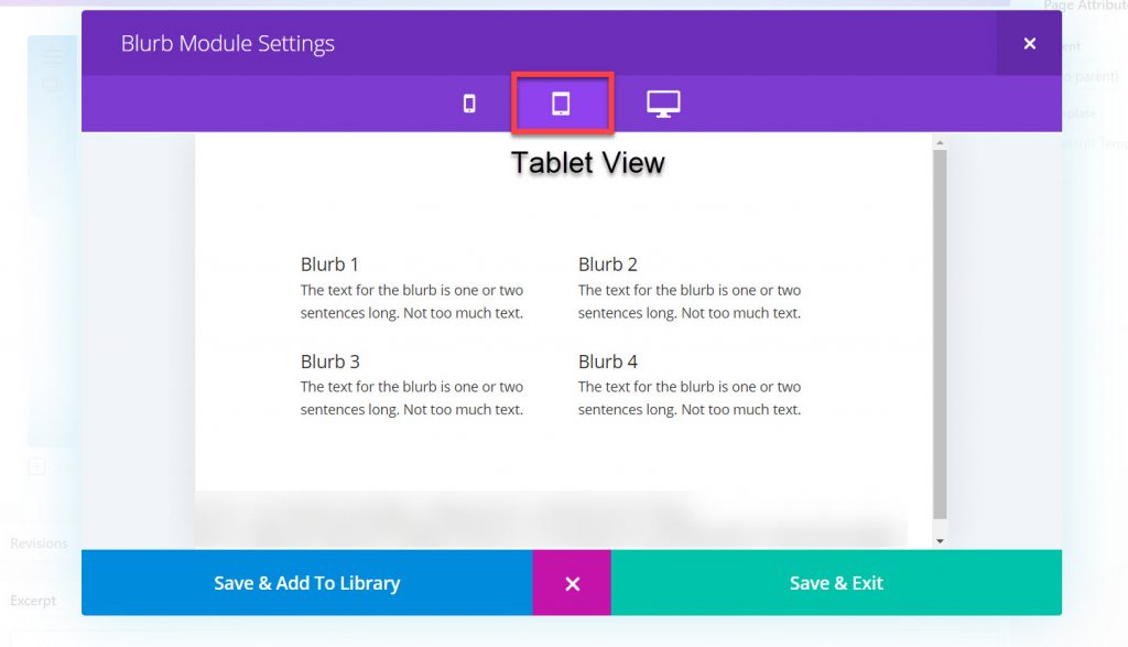
A tablet is a popular device and you shouldn’t assume everyone looks at websites on a mobile screen. The convenience of technology takes on many different forms and people have preferences. No one ever thought the Kindle book would be so popular. The tablet view divides the columns into two, one half widths.
The All Important Mobile View
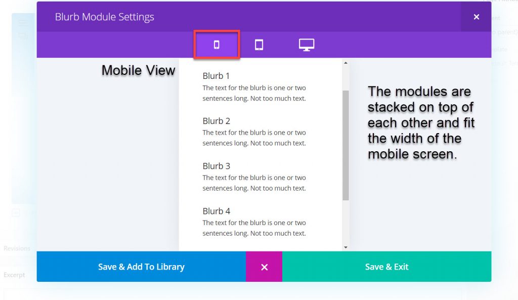
The Divi theme stacks the modules on top of each other. Notice the Blurbs are stacked from left to right Blurb 1 through 4, with Blurb 1 on top. As you layout the content in the Blurbs keep this in mind for a logical sequence of subjects if you need to.
When you’ve finished viewing click the X, the viewing screen will close. Save and exit and preview the full page on the screen you’re working in.
It’s helpful to know the Divi Builder works in the background while you put the content into the modules. The Divi Theme is so complete you can also view the desktop, tablet, and mobile screen in the Theme Customizer section. The mystery of responsive design is now solved.
There are two ways to build a website. You can build it yourself, or you can follow the designer’s lead and learn to use the Divi Theme in an already designed theme create by Divi expert designers and developers. We only covered one module in the Divi Builder, there are 37 more modules to use.
Using the Divi Builder puts you in control of the content. Once you know how the builder works you become the builder of the site.
Say it in words – design the future. When I’m not building websites in Divi, I’m writing about Divi. The most versatile, flexible theme, built for the user.

