How to Quickly Create Pin-Worthy Images From Scratch
PicMonkey is my favorite way to create an image to use on Pinterest or on my blog. The main reason it’s my favorite is that it’s ridiculously easy, it’s fast, and you can create something pin-worthy from nothing but a blank rectangle.
Just in case you’ve never created a Pinterest image before or never used Picmonkey and need a little help, I’m here to give you a tutorial.
We’ll call it PicMonkey for Newbies
You can do a billion things with this photo-editing and graphic design website, but for today we are going to focus on creating title pins for Pinterest. This is a simple type of image that simply states what your article is about.
It needs to be:
- Bold (super noticeable)
- Long and lean because that’s how Pinterest is shaped. Long, skinny images do best.
Sometimes you have an awesome picture already, and you just need to write on it. Those are my favorites, but sometimes you don’t have a picture for pinning, so you can make a clean slate with the title written on it. That’s what I’d like to show you how to make.
1. First, you are going to have to open an account.
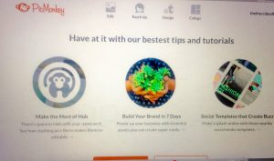
You can sign up on the home page, or you can download the app and sign on there. I have the app, but I’m more of a Macbook girl, so these directions are for the actual website, not the app.
There should be a “free trial” option in orange in the top right hand corner. The photo above doesn’t have it because I already have an account. Instead, it has my account name.
Once you have set yourself up an account, we’re ready to begin.
2. There are 4 icons across the top, all extremely useful.
Today we are going to select the 3rd option, “Design”. See below.
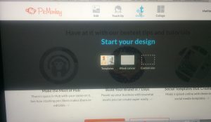
Hover over “design”, and this gray box will pop up with yet even more decisions!! Auughh! Decisions can be stressful, eh? But not today.
3. Just choose the middle option “blank canvas”.
And another decision will pop up…it’s like making a Subway sandwich…but that’s also why it’s so rad:
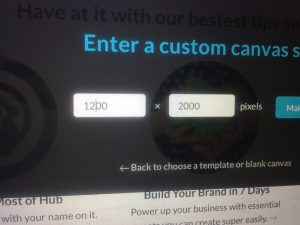
Remember, this is going on Pinterest, so ours needs to have a smaller pixel # on the left than on the right. The default is 2000 x 2000, so you must change it for optimal pinning purposes. I chose 1200 x 2000. 1500 x 2000 would probably also be fine.
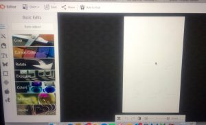
5. Look at all those options to the left. That’s your toolbar.
You can add cartoon animals, party bunting, balloons, words with different fonts, and all sorts of shapes and swirls. You can crop it, color it, layer it, theme it out. Make it noticeable!
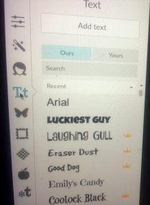
But let’s start with the text. Since this is a title pin, it needs to state clearly what our post is about. It needs to be in an easy-to-read font. none of this cursive mess. People will not slow down to decipher our pin.
This is the reason I DO pay for the Premium membership, so I can use ALL the fonts and pictures I want on my images. All of the bunting and so many of the best fonts DO require the paid membership. The price may vary, so check with Picmonkey for that, but I know it’s not much. There are very few things I pay money for as a blogger. Literally, all I pay for is my WordPress domain, my Bluehost hosting, and PicMonkey. For everything else, I use the freebie version.
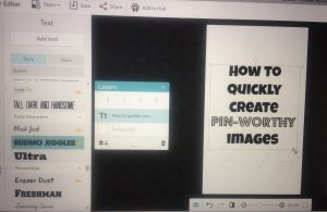
You may have to try a few different fonts before you find one you love. I chose Luckiest Guy.
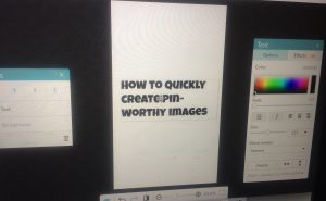
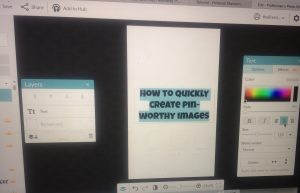
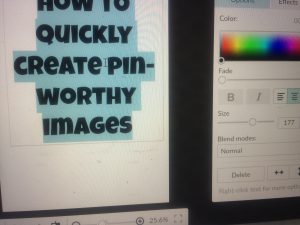
Notice the Text editing box to the right in the photo. It has a rainbow of colors, sizing, Bold, etc.
6. Type in what you want your image to say.
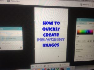
Then drag your words to where you want them on the rectangle. Notice the text editing box on the right. That will center your text for you, change the size, change the color, all sorts of things.
You can even highlight part of your text, whatever you want to call attention to, and use a different font or size or color for just that portion.
Now let’s decorate!
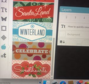
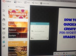
On the left, the apple icon represents themes. First, I chose the Celebrate theme.
7. Lots of options here. Choose whatever you like.
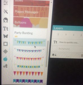
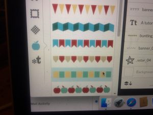
I scrolled on down and chose a bunting. Don’t worry about the color in the toolbar because you can customize the colors of your bunting once you select it.
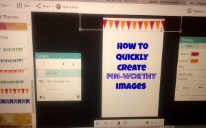
8. I chose the triangles, and then I customized the colors.
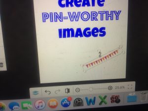
I wanted to call your attention to how you can tilt your bunting any way you’d like. Just use the circle at the top of the bunting mover. It will rotate the bunting.
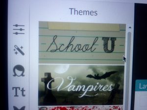
I still need to fill the bottom space on my image, so I went back to the apple icon and chose the theme School U.
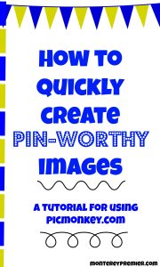
I chose the squares, and then I adjusted the colors, and I flipped the squares sideways, placing them along the left edge. I was trying to create sort of a notepad look.
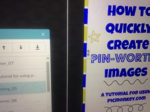
As you can see, I also added a little more text to more fully explain what this post is about, and I added some squiggles to spruce up the image.
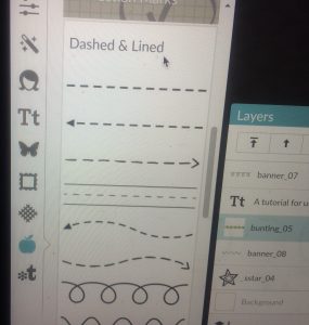
Squiggles are also under the School U theme. This option is called “Dashed & Lined.”
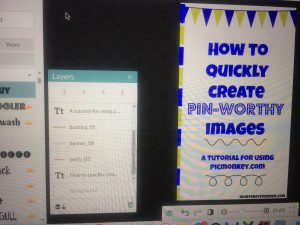
I added stars too, but then at the last minute I decided that made my pin too busy, so I deleted them.
I think it also would have been cute if I had just done the squares all the way around the image instead of just one side, but then you have to worry about lining it up equally and….eh…..the whole point of this was to QUICKLY make an image, so I let that idea go.
Final Thoughts
I hope this helps you bring more readers to your blog from Pinterest, and if you need anymore Pinterest ideas, or if you need to be convinced to USE Pinterest, read this. It is a well-proven way to bring tons of traffic to your blog or website.
Happy creating, y’all! If you have any questions, be sure to ask in the comment section below. Ready to try out PicMonkey? Here’s the link. Have fun.
featured image: depositphotos.com
April Alan is a happy mom of four boys, and she also writes at https://storiesofourboys.com. When she isn’t blogging, she’s usually doing exotic things like cooking, picking up kids, and coloring Mickey Mouse with her toddler.

