From 2009 until very recently, I called myself a writer and professional speaker. By way of background, it took a while, but my books eventually led to proper speaking (read: paid) speaking gigs. Even when I wasn’t speaking in front of a group of folks, I observed how others comported themselves on stage. For instance, I attended probably 80 or so conferences while I lived in Las Vegas. Long story short: I’ve seen all kinds of folks on stage and most speakers suck.
To be sure, I’ve seen some speakers light up the stage. Still, a competent—much less dynamic—orator is rare indeed. Put differently, for every dynamo like Keith Ferrazi, there are probably 20 or so duds.
Of course, one could write a book on public speaking—and many have. Confessions of a Public Speaker is one of my faves. Today, though, I’ll focus on one critical aspect of speaking: slides.
Sloppy Slides
At a recent conference I attended, I marveled at the complexity and utter inscrutability of just about every slide shown. Lamentably, all speakers concerned themselves with whether they understood their PowerPoint decks—not their audiences. Make no mistake: this fundamental disconnect has doomed many talks from the beginning. And this is doubly true in an era in which each audience member is packing a minimum of one attention-seeking device on his/her hip.
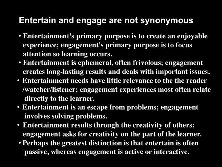
Don’t believe me, though. Check out a few of the slides that I’ve seen over the years:


The above slide is so convoluted that the speaker himself has to turn his back on the audience to even read it. Most amateur speakers think that their audiences are reading their slides while concurrently listening. (Most of the time, they’re doing neither, and I doubt that anyone paid much attention to the speakers who presented the slides above.)
When I approached the podium to give my 20-minute talk a few weeks ago, I used the most spartan slides possible. Beyond that, I know from experience that images speak far louder than words. Sure, I use notes, but I keep them where they belong: in Presenter View, not on the slides.
As expected, my talk resonated with the audience. People were looking up at me—and not down at their devices.
Simon Says: Remember that the audience’s comprehension is paramount—not yours.
Socrates and Plato didn’t use projectors and computers to deliver speeches. To quote from the Marillion song “Montreal”, “Technology is wonderful when it isn’t in the way.”
In the case of speaking, don’t blame PowerPoint, Keynote, or Prezi for your horrible slides. Blame the Indian, not the arrow. Remember that less is more.
Feedback
What say you?
Phil Simon is a frequent keynote speaker and recognized technology authority. He is the award-winning author of seven management books, most recently Message Not Received. He consults organizations on matters related to communications, strategy, data, and technology. His contributions have been featured on The Harvard Business Review, The New York Times, Fox News, and many other sites. In the fall of 2016, he will be joining the faculty at Arizona State University’s W. P. Carey School of Business.


