Divi is a popular and powerful theme that can be enhanced through code to add lots of new features. What if you don’t want to add code to your theme? Maybe you want a simpler solution. Code is great but it can be time-consuming and can get frustrating when there are issues to debug. An easier way to add enhancements is through plugins.
Fortunately there are several plugins available to add enhancements to Divi at the flick of a switch or click of a button. In this article we’ll take a look at two of the most popular plugins for Divi: Divi Booster and Divi Switch.
Both plugins add a lot of features. We’ll take a look at a few and at the end I’ll list some of the features that stand out for each one. For some of my examples I’m using the Homepage Extended layout that’s built into Divi. Images are taken from Unsplash.com.
What is Divi Booster?
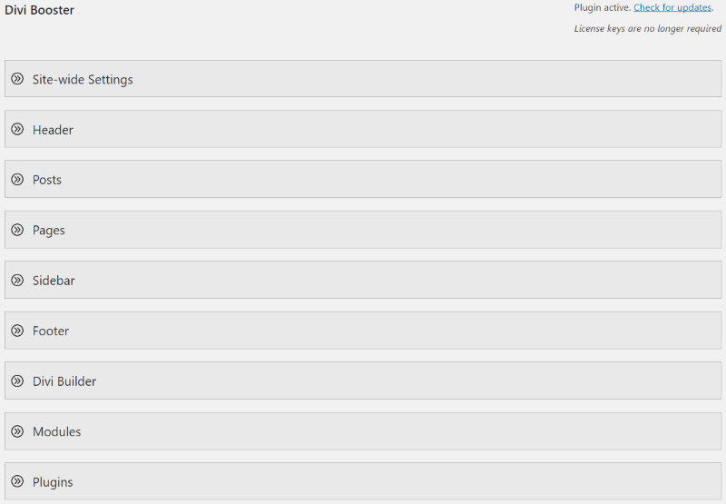
Divi Booster adds a set of toggles that includes settings grouped together under categories. Selecting a toggle opens it to reveal the toggles within. To see the interface go to Divi, Divi Booster in the dashboard.
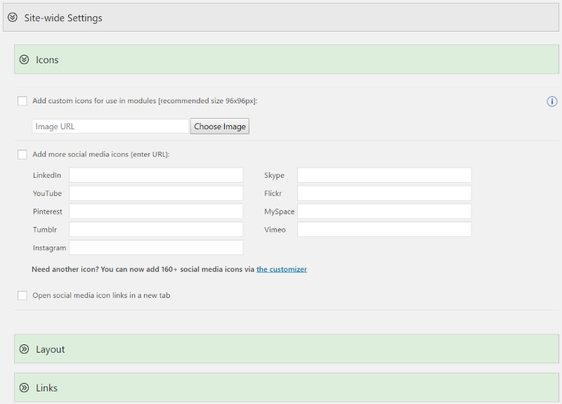
Each toggle is closed by default. Opening them reveals their settings. Each one has a link for more information. Many of the features have boxes where you can enter values or boxes you can turn on or off. The links take you to blog posts that teach about what the feature does.
Settings include:
- Site-wide settings
- Header
- Posts
- Pages
- Sidebar
- Footer
- Divi Builder
- Modules
- Plugins
- CSS Manager
- Developer Tools
- Depreciated
What is Divi Switch?
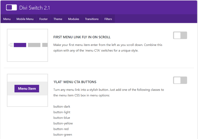
Divi Switch is a set of features that you can toggle on or off using switches. Unlike Divi Booster, which has a save button, Divi Switch saves the setting as you click the switch. Also unlike Divi Booster, it includes some CSS classes that you can paste into the CSS class of any section, row, or module. See the menu by going to Divi, Divi Switch in the dashboard.
Categories include:
- Menu
- Mobile menu
- Footer
- Theme
- Modules
- Transitions
- Filters
Examples
Let’s take a look at a few examples of what each can do. Both have many options to choose from. We’ll look at headers, footers, and portfolios.
Headers
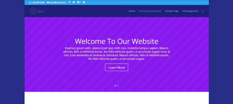
For this example I’m using the Homepage Extended layout and I’ve set the layout in boxed mode. Here’s a look at the header before boosting or switching.
Divi Booster
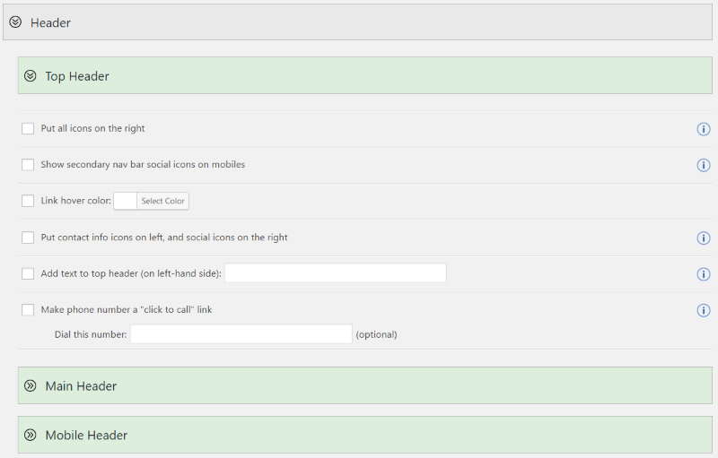
Divi Booster includes features for the top header, main header, and mobile header. The top header includes settings for the icons, hover color, add text, and making the phone number clickable.
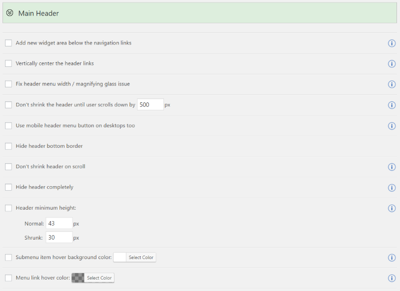
The main header includes features such as a new widget area, vertically centering links, setting the pixel size of when the header shrinks, hiding borders, using mobile header on desktop, hiding the header completely, setting the height, changing colors, adjusting space between the menu items, changing the logo URL, showing the title and tagline, etc.
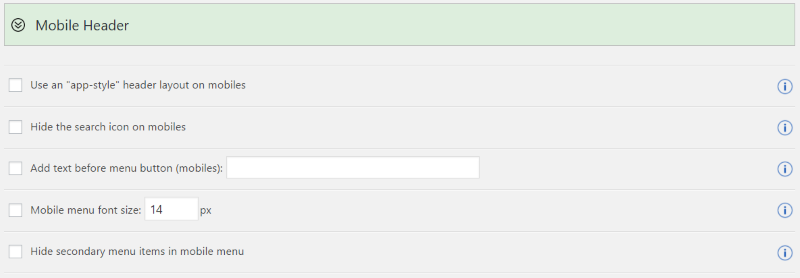
The mobile menu includes an app-style layout, hiding search icon, adding text, setting the font size, and hiding the secondary menu.
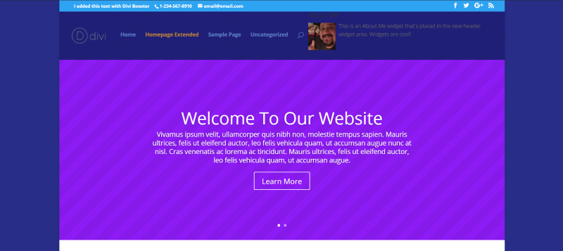
In this example I placed text within the top menu, made the phone number clickable, and moved the info icons on the right and the contact icons on the left. For the main header, I’ve added a new widget area (and dropped in an About Me widget, changed the link hover color, and set the menu height to 80.
Divi Switch
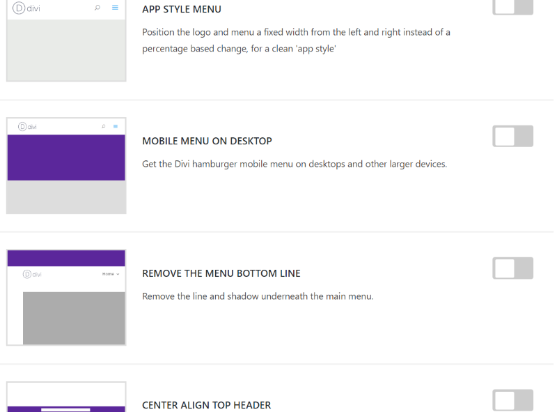
Divi Switch includes a fly-in menu link, flat or 3D CTA buttons, app style menu, mobile menu on desktop, alignment, font size, removing the border, light or dark side menu, menu icons with text, show text on mobile, etc.
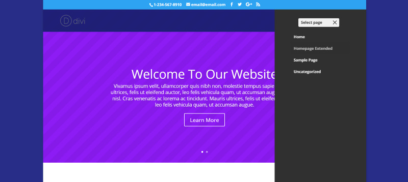
For this example I’ve switched on the mobile menu on desktop, center align top header, enlarge the phone and email info in the top header, side menu dark, and show ‘select page’ on mobile menu – light.
Both
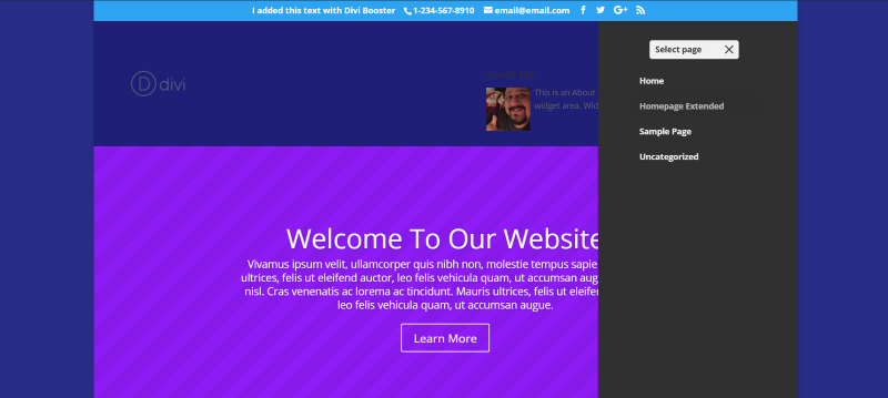
As you can see from this example the two plugins can work together. There will be some things that clash (for example, if you set both to do the same thing or modify the same element), so you might have to experiment.
Footers
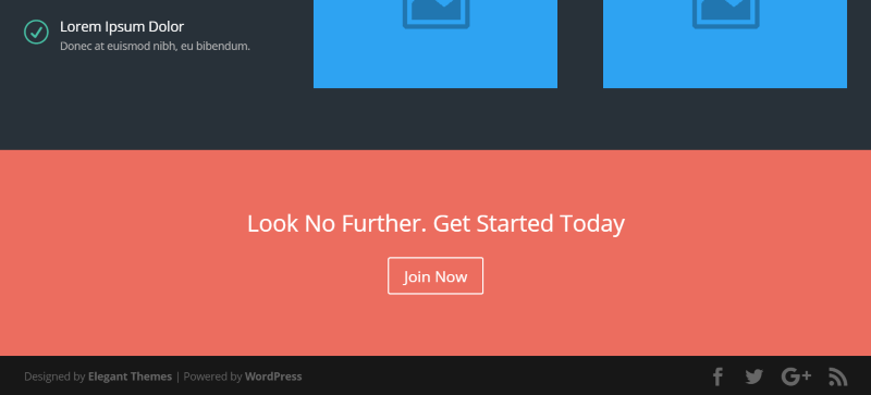
This is the standard Divi footer. It includes text with links on the left and social icons on the right. We can modify both elements.
Divi Booster

Divi Booster allows you to center the footer links and to place your own HTML within the footer. It even includes shortcodes for a copyright symbol and the year in two different formats.
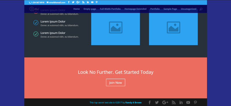
Here’s the result. I made my name a link, used h4 tags, and made the text white. I created it in the Visual Editor, clicked the Text tab, and copied the code. You could just use the regular text for the footer but I wanted to use HTML just because I could. A site-wide setting allows us to add social icons or our own images. I’ve added icons for LinkedIn, YouTube, and Pinterest.
Divi Switch
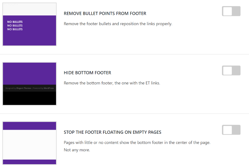
Divi Switch lets you remove the bullet points, hide the bottom footer, and stop the footer from floating on empty pages.
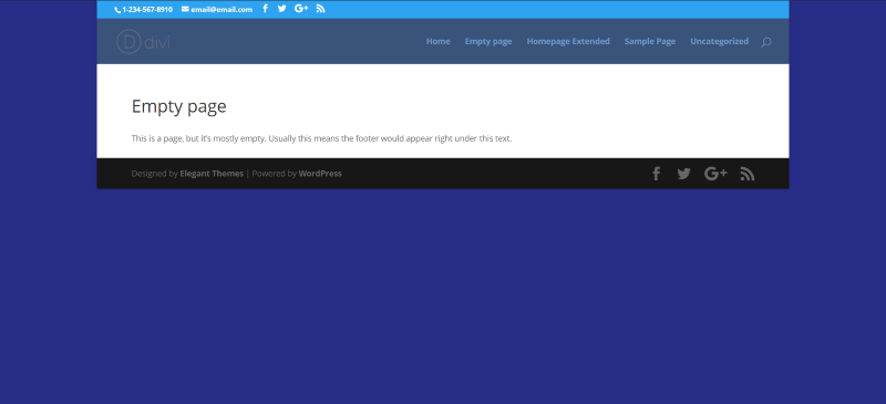
This is the standard footer on a page without much content. It floats upward to meet the content and looks awkward. Divi Switch can fix this.
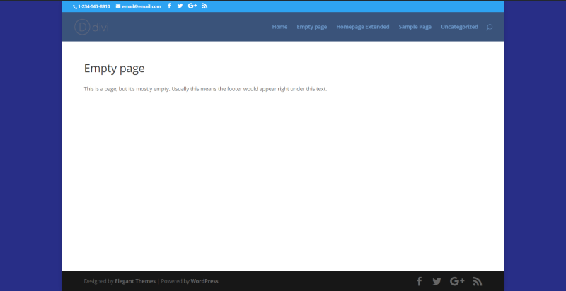
The footer now appears at the bottom of the page, keeping it consistent with the rest of the website.
Both
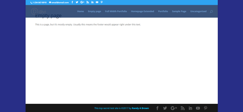
In this example I used Divi Booster to create the text with link in HTML and added social icons, and then used Divi Switch to keep the footer from floating.
Standard Portfolio
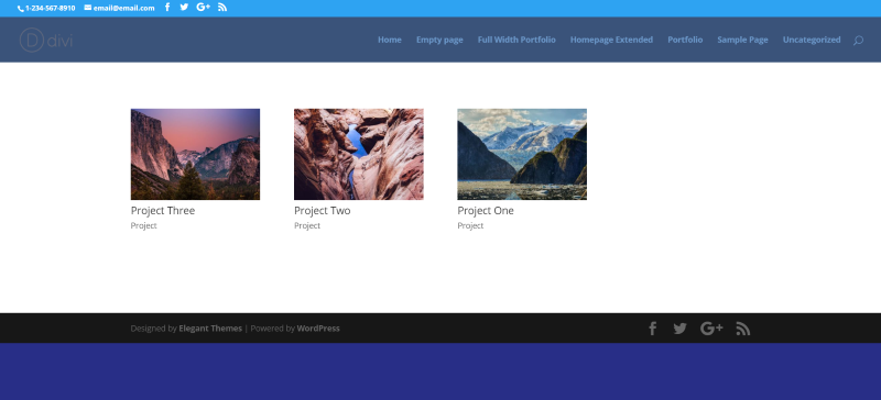
I created a page with a portfolio module, set it to a grid layout, and left the rest of the module’s settings to default. I also created a few sample projects. The image above is the example page before enhancing it with the plugins.
Divi Booster
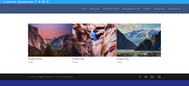
I set the grid to show 3 per line and increased the image size by 1.6. It enlarges the images and centers the portfolio.
Divi Switch
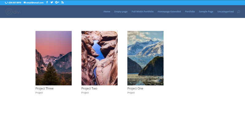
This one keeps the footer from floating and uses ‘Book’ portfolio images. Other options include ‘Square’ and ‘Cinema’.
Both
For the standard portfolio, both plugins control the image size or shape. Using both at the same time to control the image size isn’t necessary. However, you can control the size with one and add an overlay with the other.
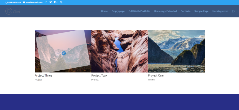
In this example, Divi Booster is controlling the image size while Divi Switch is controlling the overlay.
Full Width Portfolio
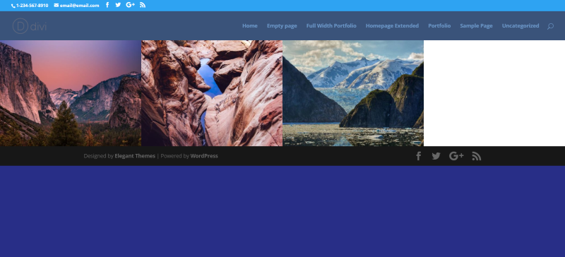
This one uses a full width portfolio module set to a grid layout with the post number of 3. I’ve changed the layout from boxed to full-width.
Divi Booster
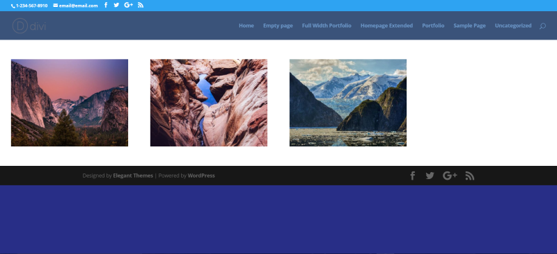
This one uses the two full width portfolio settings: Add space between project images for grid view, and Stop project images from being stretched and cropped. It adds white space on all sides of the images.
Divi Switch
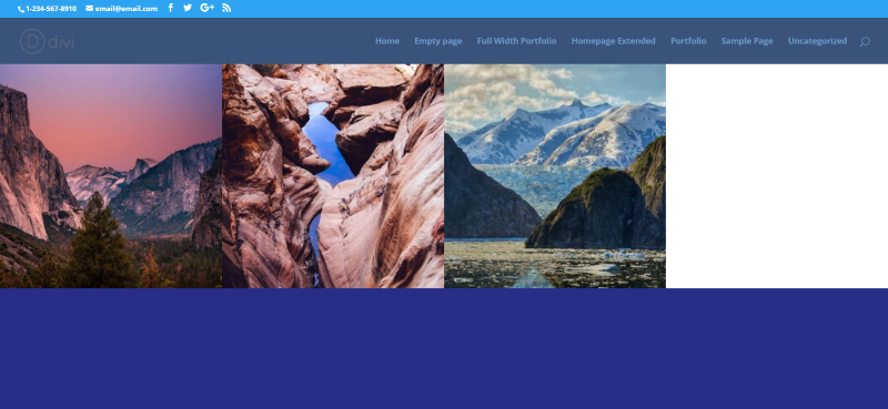
This one sets the images to square. As before, I’ve selected to keep the footer from floating.
Both
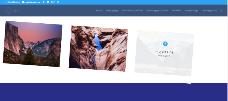
Here’s a look at both together. From Divi Booster it adds space between images and stops the images from being cropped. From Divi Switch it uses a CSS class of Rotate (which rotates the entire module), it keeps the footer from floating, and uses square full width portfolio images.
Advantages of Each
Both plugins offer lots of features. Here are a few that stand out for each one.
Divi Booster
- Add social icons to footer
- Divi Builder on Custom Post Types
- Custom footer
- Widget in header
- Sticky widget on left
- Image above header
- Main content overlap header
- Compression
- Page layout option on Divi Builder pages
- Sidebar background color customization
- Make Divi Builder full screen
- Module customizations
- Remove WooCommerce icon
- Developer tools
Divi Switch
- Section Separators
- Cleaner blog comments
- Side menu
- Section separators
- Cleaner blog comments
- Code boxes
- Two-column archive pages
- No sidebar on archive pages
- Multiple shapes for portfolio images
- Blurb icon animation
- Project overlay animations
- 27 CSS hover transition effects
- Slide effects
- Image filters
- Text shadow
Final Thoughts
As you can see from these examples and features that both add lots of handy features to enhance Divi. This article just scratches the surface of what each plugin can do. There are enhancements for just about every module, lots of animations, tweaks, and much more available at the press of a button.
Rather than trying to choose only one, I recommend using both plugins. Both have features the other doesn’t and they work great together. The time it takes to code these features yourself will more than pay for the plugins.
We’d like to hear from you. Do you use Divi Booster or Divi Switch? Tell us about your experience in the comments!
Randy is a WordPress writer and child theme developer from east TN. You can catch him writing, reading, guitaring, or drinking coffee just about any time, night or day.

