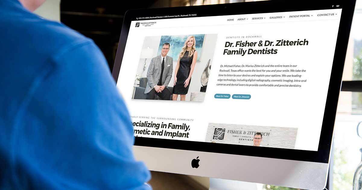
Monterey Premier took over website management and hosting for Dr. Michael Fisher and Dr. Marisa Zitterich in 2019.
F&Z Dentistry is in Rockwall, Texas, and they recently moved into a beautiful brand new building. Naturally, they wanted a website that matched the new modern design of the office. So after a few strategy sessions, we began the redesign with the following goals in mind.
A Fresh New Look
Overall, the site needed to be clean, modern, optimized for search, better use of space, and as inviting as they are at the office. That meant real people & real videos, and no stock photography or videos were allowed.
We started with a recent photoshoot to help me capture the colors and textures of the office.
This is the image I used to put together the primary colors for the website: black, white, silver, & a hint of cobalt teal. With the new colors approved, we put together an excellent modern font combination of bold Montserrat headers & Lato as the body text.
You will also notice the use of a third thinner font style before the headers to add a nice contrast visually and allow for the use of a few extra keywords for SEO.
Telling Their Story
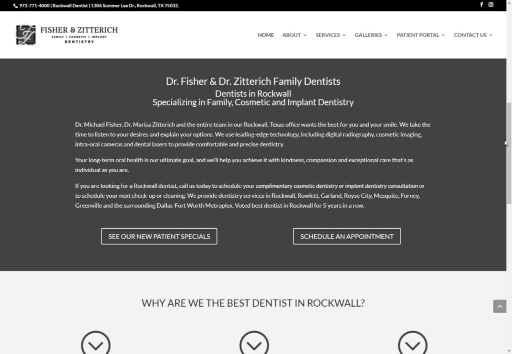
While the information on their existing website was good, it wasn’t telling their story. As you can see on the old home page, the majority of the home page text was bunched into a single area and did not give much room for imagery to go along with it. Breaking up the content a little bit allowed us to expand on a few items without cluttering things up.
- Before
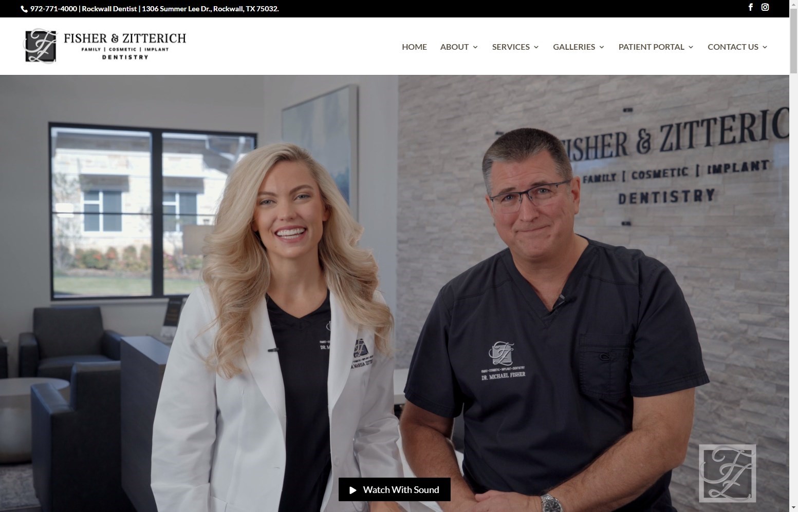
- After
One of my objectives was to make sure this new home page would perform even better than the last one. By expanding on the homepage content a bit, it helps us give the user a better idea of what they can find throughout the site. I can’t wait to see the SEO results in a few months. 🙂
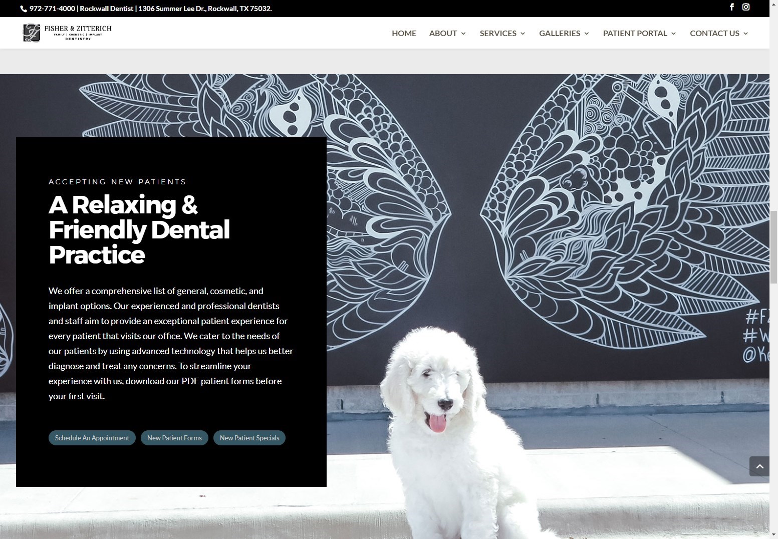
You will notice each significant section has at least 2-3 buttons that lead to related pages. To keep things clean and uncluttered, we chose to use a smaller button than usual, but the accent teal makes them pop just enough to let the user know it is there.
Welcome To Our Practice
We wanted the website visitors to feel like they walked into the actual office, so we decided to go with a video. We set it up so that it is the first thing you see, and it automatically starts playing when you land on the site. We have the sound turned off and added a button to pop up the video with sound.
One of the ways we were able to convey a better sense of the atmosphere inside the actual office was to have more pictures of them in the office. Creating a nice collage of a few offset pictures helps the visitor know what to expect when they arrive for the first time.
A Footer With A Mission
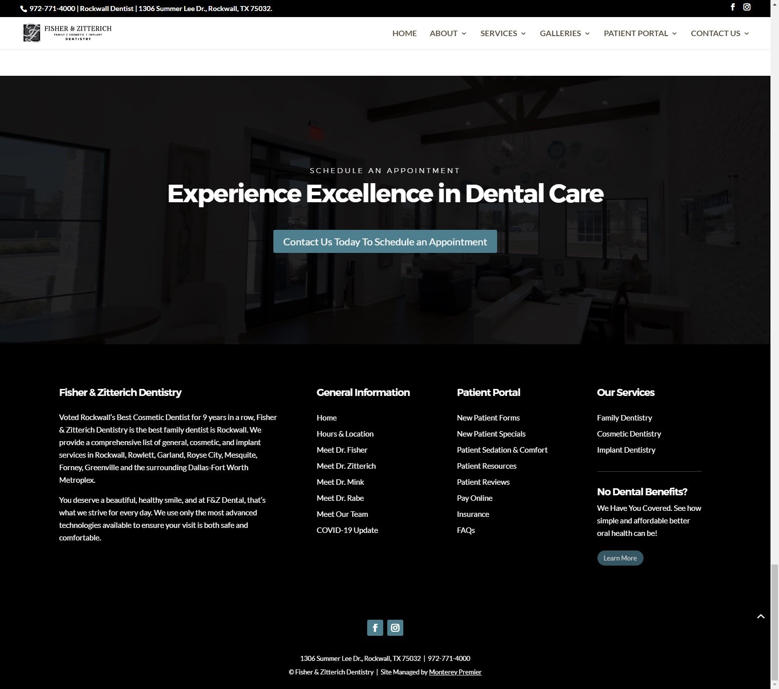
There was not much left for the visitor to do once they got to the bottom of the page so we added a bold new call to action at the end of each page.
There are many sub-pages on the site, but you had to go through all the drop-down items in the main menu to see them. In addition to scattering more links throughout the home page, the new footer contains links to all the main pages. So now, when visitors get to the bottom of the page, they can see all the other pages that may be of interest to them.
Client Testimonial
“Geno has been fantastic to work with! We wanted to update our website with a fresh new look to the home page. Geno was very responsive and got this update done very quickly. He was easy to communicate with either on the phone or by him sending recorded videos of what changes he made so I could listen to the video and respond in between seeing patients. We really appreciate his hard work and love the final outcome!! Highly recommend!!” – Dr. Marisa Zitterich
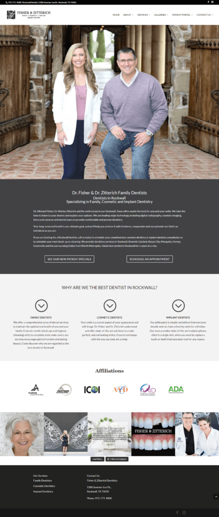
Here is the full before and after screenshots for the home page.
BEFORE
AFTER
Geno Quiroz serves on the Marketing & Technology team at IPX1031, a Fidelity National Financial company and a national leader in 1031 tax-deferred exchange services. In his current role, Geno focuses on website architecture, design, development, SEO/AIO, and digital marketing strategy. His work helps strengthen the company’s digital presence, improve user experience, and ensure that IPX1031’s online platforms effectively support client engagement and long-term growth.
Concurrently, Geno continues to lead Monterey Premier, the web design and strategic consulting firm he founded in 2015. Through Monterey Premier, he partners with entrepreneurs, nonprofits, and growing organizations to design high-performance websites, refine digital sales funnels, and implement conversion-focused strategies.
His hands-on experience building and scaling a client-facing agency has provided him with a real-world understanding of growth strategy, brand positioning, and the operational realities of business ownership — experience that now directly informs and strengthens his work in enterprise marketing technology.

