Prepare to hear something terrific, 2020 is just around the corner! So, it’s time to write a list of the accomplishments and plans for the next 12 months. As for webmasters and web designers, a new year came to them in the form of new tendencies in web design they need to follow. Today, it’s not a matter of being modern or stylish. It’s the necessity to adapt to new technologies faster than others.
A website isn’t just a simple page of a company online; now, it is the identity of a brand. In fact, 75% of consumers consider website design to be the most telling factor about the credibility of a business. If you’d like to stand out, you have to take at least three steps at a time. So, if you are ready, let’s discover which web design trends will take over the next year.
Main Web Design Trends: Minimalism & Uniqueness
2020 will become a triumph for minimalism in web design. Though the signs of it have been already spreading everywhere, this year it will rock. Both web designers and users are tired of the excess of creativity lately. And both of them want some simple and clear solutions. So, one way or another, all web design trends of 2020 meet this request.
1. Bright colors
Color is one of the most important designer tools. And, since it’s all about simplicity, there is no choice but to use it boldly.
The bright color is noticeable. It grabs your attention and creates an association with the product. Grades and shades are elegant, but they will never have an impact like a single bright color.
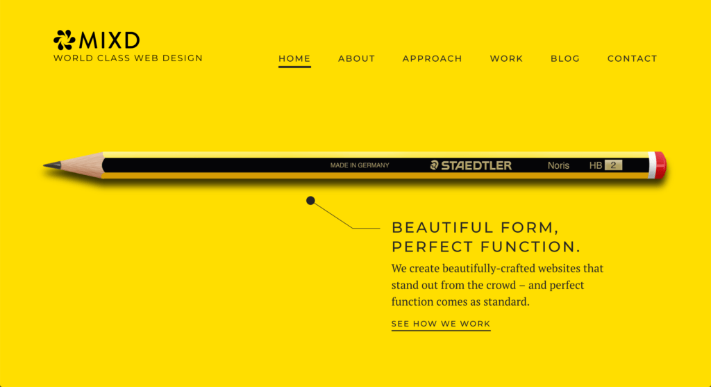
Besides that, colors do impact our frame of mind. Psychologists state that each color of the spectrum provokes different moods. Yellow, for example, is considered the happiest color on the spectrum. Obviously, web designers from MIXD knew about this.
They used one color and gave the simplest reference to the old-school designer tool. It couldn’t be simpler. Yet, it’s perfect. They delivered the message.
2. Asymmetrical layouts
Playing in minimalism, web designers are using the basic tools, like color and forms, to the most. And we like it. Asymmetrical design makes a website unique, novel and bold.
Asymmetry is an eye-catcher that makes your brain work. Sure, sometimes plain traditional layouts are better. But asymmetry attracts users’ attention like a puzzler. It awakens the mind, creates the illusion of motion and presents a brand as a versatile one.
Yet, there is a catch. It is good for a website about traveling (emotions, plans, fun). But it is a bad choice for websites about health care or law (where the information has to be structured properly).
3. Hand drawing
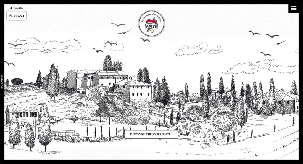
When the modern tools aren’t your allies anymore, it’s time to recall the good old hand drawing. This web design trend came back as no big deal. Indeed, who can’t hand draw? Well, technology can’t.
Web designers have already understood that a website isn’t just an ad or a business card. It is a face and it has to be vivid; human. In 2020, hand drawing can be used in separate elements of the website or as the main idea. In both cases, it adds a spirit to the product and makes it memorable.
4. Typography
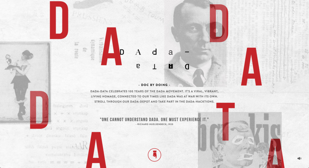
According to a survey, 95% of the information on a webpage is text. It holds second place after color. Carefully selected typography makes magic. It attracts users’ attention as well as bright colors. Original or even freshly invented font will help you to get the emotion you need with ease.
Using typography as the main design feature for your website, remember it has to be adaptive and easy to read. Do not confuse the reader with intricate fonts. Make your message loud and clear.
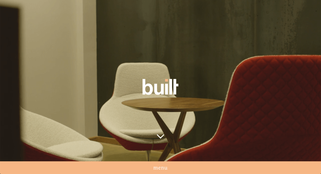
5. Hidden navigation
One of the main goals of web designers in 2020 is to cut the distractions off. Instead, they want the user to focus on the central message of the product/brand. And the hidden navigation is one more great way to do it.
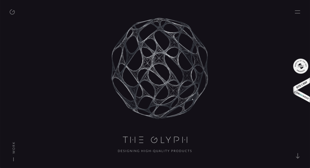
The navigation doesn’t need to be hidden well. It has to be obvious; the user has to find it easy, at one glance. But it should be out of the main image. It’s simply not as important part of a website as it was years ago. The small icon in one of the corners on the top of the page will do.
Conclusion
To sum up, the new web design lighthouses in the sea of customers’ requests and brands’ purposes will be uniqueness and clarity. It could be hard to moor to them with limited tools. However, they serve the main purpose of the web design ideally. Yes, above all, websites have to be useful and usable. And 2020 web design trends are perfect to complete this mission.
Featured image credit: unsplash.com
Rhonda Martinez is a marketing journalist, entrepreneur and writer. She works for a website dedicated to MBA essay writing services and helps students with their MBA applications. Rhonda is passionate about entrepreneurship and marketing, so she never misses an opportunity to deepen her knowledge in these areas.

