Type font… typeface… typography… font… Are they all the same? Even designers get confused! We know it can be tricky, but this is the guide on the essential typography terms to master and use properly.
Once you finish reading this illustrated glossary, there will be no room for doubt!
The Essential Typography Terms
It may have been years of using the wrong term to refer to how to use a font, but learning essential typography terms is pretty easy once you know the differences. Once you master these terms, you can communicate better with designer peers and get accurate results.
What Is Typography?
This is the first and most fundamental concept to know. Typography is the visual component of the written word, a discipline between technique and art.
There are professionals exclusively dedicated to typographic work. They focus not only on the readability of a text but also its aesthetics and the balance of a page’s design. The good thing is that if you master the technical terms, you’ll be one step closer to becoming an expert.
Keep in mind that typography is not another word for font, but fonts and other graphic definitions are the essentials of typography.
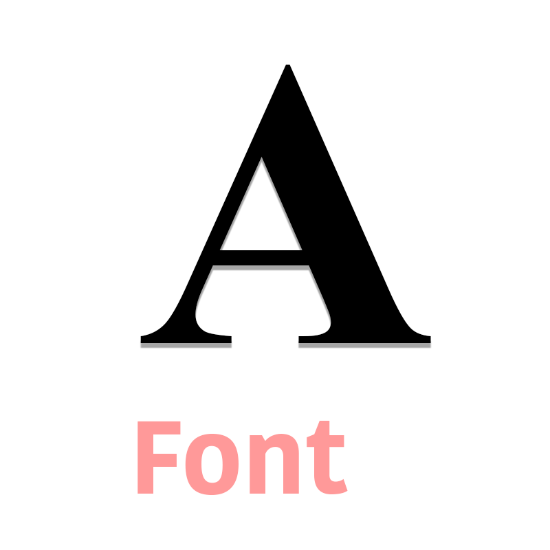
Font
- The most basic graphic representation of text.
How to choose a font? The best ones come with a variety of styles that make a complete family, so you can play with different weights, some are narrow and thin, some are heavier and wide.
Font Family
- A collection of fonts that look alike and are designed to be used together.
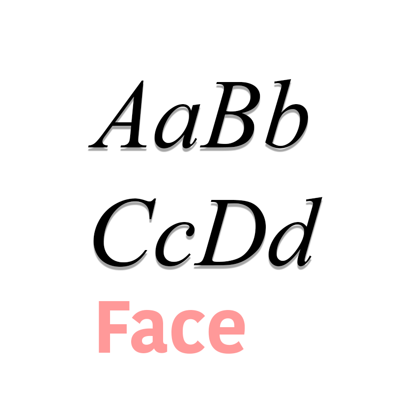
Face
- A style from a family of faces.
Typeface Definition
What’s the difference between font and typeface? A simple typeface definition is the collective of a family of fonts, while a font refers to weights, widths, and styles.
When going for different families for the same compositions, one of the best practices is to use typefaces that share similar x-heights.
Typeface Family
- This is a collection of similar fonts (regular, semibold, bold, extended and compressed). Also called a typeface family.
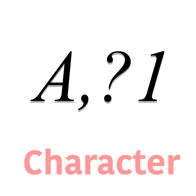
Character
- A single element (letter, number, a mark of punctuation).
Alternate Character
- Also called an alt character. It’s a version of a standard character or a symbol.
Typographic Color
- It determines how dense the text appears, regarding its lightness or darkness.
Typography Anatomy
Arms, legs, and joints? Let’s talk about typography anatomy!
Arm
- A horizontal stroke that doesn’t connect to a stem.
Leg
- A descending stroke.
Joint
- Where the stroke crosses a stem.
Foot
- Where the stem rests on the line.
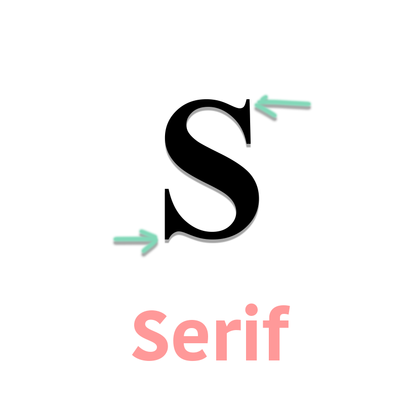
Serif
- A small stroke where a larger stroke ends, it’s usually decorative.
Barb
- The barb is a sharp and pointed serif.
Bracket
- The bracket is a curved connection between the stem and the serif.
Sans Serif
- Without a line, it’s a typeface that doesn’t have a serif or embellishments.
Beak
- A beak is a decorative stroke at the end of the arm. It is similar to a serif but more pronounced.
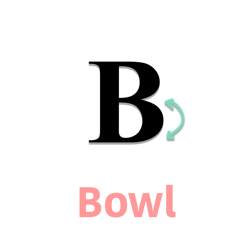
Bowl
- It’s exactly what comes to your mind when you think of a bowl, but graphically represented in a font.
Italic
- A version of a typeface that tilts from left to right.
Bold
- A typeface with darker, thicker strokes.
Condensed
- A narrow version of a font, it’s used to fit more characters into a space.
Terminal
- The end of any stroke that doesn’t have a serif.
Vertex
- The angle where two strokes meet.
Weight
- The heaviness of a typeface: thin or regular.
Measurements
Among other typographic terms and typography anatomy, there are technical terms to keep in mind when referring to measuring and sizing.
Pica
- Unit to measure a typeface. Equivalent to 12 points.
This measurement method was created in the 18th century, and one point was 1/72 inch, but in the digital world, this is equivalent to a pixel.
Point
- A unit that’s equivalent to 1/12 pica.
Point Size
- The size of each character in a font.
Paragraph Terminology
A paragraph consists of an idea written in one or more sentences, and how you arrange it within a space can help or hurt your message. Although there’s a lot more on paragraph terminology, keep the following concepts in mind, particularly when working on newspapers, magazines, and other print media.
Alignment
- How the lines align vertically along a margin. When the text is justified, words have more space between them to avoid the white space at the end of a line.
Body Text
- Paragraphs in a page. This should be set in an easy-to-read face within a 12 or 10 point size.
Orphan
- When a line is too short and appears to be by itself because of the whitespace.
Widow
- When a line ends at the beginning of the next page or column, separated from the rest of the paragraph.
H3. Length
- In typographic terminology, the length is measured by the average characters per line.
Bleed
- When images or text exceeds the edge of a page. Full bleeding is when they exceed all the borders, and it’s not necessarily a bad thing. Printers use it for brochures, posters, and other kinds of materials.
Typographic Terms for Editorial Design
Do you know the difference between kerning, leading, and tracking? It’s pretty simple.
- Kerning refers to adjusting other letters next to each other to optimize readability. It depends on the shape of each letter to suit each other.
- Leading is how text is spaced vertically. When you have multiple lines, the distance between them should be enough to keep them legible.
- Tracking refers to the space among the entire word, and should be used carefully because it may cause difficult reading.
- Whitespace is the space that’s left between graphic elements in a composition, and it’s important because it leaves visual room to breathe. This is especially important in web design because it allows you to highlight important things likes CTA buttons and menu options.
Using Typography in Advertising
Fonts can really work in your favor if you choose them correctly. Think about the all-time favorite and most popular brands and how you can recognize the font they have in their logo almost anywhere.
When creating a logo, make sure you go for a suitable font that is readable and matches your brand. You can also use a logo maker to try a variety of options and choose the one that does the trick.
Also, copywriting is a very powerful marketing tool, and you should pick a great font to get your message across.
![]()
Typography Do’s
These are no strict rules, but take these tips into account to make your design look better.
-
- Establish a visual hierarchy. If everything looks the same, readers don’t know what’s the most important information. Size, headings, and subheadings establish hierarchy and allow readers to find things easily.
- Give room for the text to breathe. Put readability first and remember that when the text is too tight, words can be visually lost among the lines.
- Limit your text. It’s better to separate paragraphs and write shorter sentences because this allows the reader to get the idea better.
Typography Don’ts
- Don’t use all caps. This applies to anything that’s not a title or initials. If you’re trying to emphasize something, go for a different weight from the same typeface family.
- Don’t use too many fonts on the same page. Resist the urge to use all your favorite fonts in the same material; the best practice is to use a combination of two.
Of course, rules are made to be broken, just make sure you break them correctly to achieve a creative, groundbreaking result.
A Brief History of Typography
It’s time to go all the way back when humanity communicated through pictograms (20,000 B.C.) that represented ideas, then evolved into basic typographic systems several centuries later.
Phoenicians were the ones who created the first alphabet, then the same one was used by the Greeks, but the first movable types –the ceramic ones that were used for printing paper books– were invented in China during the Song Dynasty (1040 A.D.)
Fast forward to 1450, when Johannes Gutenberg started printing with a movable-type press; this is considered the beginning of modern typography. He printed out a forty-two-line Bible.
Then printing began happening out of Germany, the Italians then started printing in Subiaco (circa 1465), and the first press was opened in Venice in 1469. Later, the French started to print in Lyon and Paris, and the English began doing so in Westminster and London.
By this time, book printing was very experimental and depended largely on what the religious authorities asked for. It was not until 1884 when the mechanical type composition –also known as the linotype– was patented by Ottmar Mergenthaler, a German inventor. This was the real beginning of modern book printing.
When the Industrial Revolution happened, printing changed forever. Printers started to produce a lot, and private presses emerged, especially in Europe, companies began to make a name for themselves, as well as typeface designers.
Famous and Historical Fonts
- Helvetica. One of the most famous fonts is based on a previous font design called Akzidenz-Grotesk, popular in Switzerland. Then the name ‘Helvetica’ came up to sell it better in America; it means ‘Swiss’ in Latin, and it was created by Eduard Hoffman.
- Baskerville. It was designed in 1754, and influenced by the process of John Baskerville, a master type-founder and printer. We still use this typeface because it mixes classical typefaces and high contrast. It was created with really high standards, resulting in an elegant, readable, and refined font.
- Times. A Roman serif designed by Stanley Morrison in 1931. The name comes from the Times newspaper in the United Kingdom, and it was released in 1932 to improve its readability and print quality. Nowadays, it works well for print and digital media and remains popular all around the world.
- Futura. Its capital letters are inspired in ancient Greek letters. Though some people link it to the Bauhaus, Futura was released in 1927 and had nothing to do with the design school.
- Rockwell. This font was modeled after a 1910 font called Litho Antique, it was released in 1934 by Frank Hinman. Its slab serif makes it appear to be inspired by a Western movie because it was the result of wooden types. Rockwell is used in the Guinness Book of Records.
Essential Typography Books
In case you’re wondering how to keep the essentials of typography right on your desk, you can keep these books on hand:
- Typographie (1967). This book, written by Emil Ruder discusses the basics of weight, legibility, and spacing with illustrations in black and white and some hints of color. It’s a timeless reference that every generation should have on their shelves.
- Thinking With Type (2007). This book by Ellen Lupton talks about the role of typography in communication. She includes discussions on print and web essentials, lettering, and creative advice.
- An Essay on Typography (1931). Written by Eric Gill, this book reflects on art and industrial society. It has been out of print, but you can still find it online or get a used copy.
The Future of Fonts
There’s currently a lot of talk about fonts and how they’ll adapt to new technologies, and it appears to be great news for designers. The emerging formats of digital fonts will allow creators to manipulate and choose from a variety of 99 flexible weights, adapting them to the user’s needs; these are called variable fonts.
They allow designers to control each font’s behavior and how they combine them, meaning that load speed will be faster on digital platforms.
Digital Typography
These are some basic principles to keep in mind when choosing fonts for digital material:
- Keep it simple and don’t mix excessively.
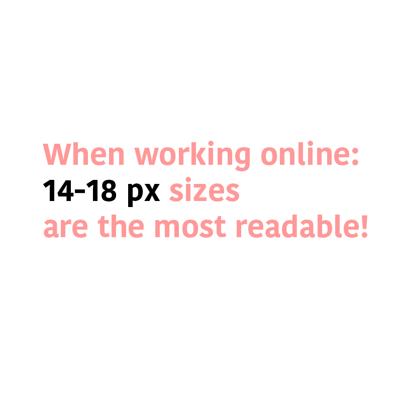
- Text for the web should be at least 13 px. 14-18 px sizes are the most readable.
- White space should be about 150% of the x-height.
- Unless intended, try to align paragraphs to the left.
- Sans-serif fonts are best when reading digital content; whereas serif fonts are better for printed material.
Here are a few concepts you should also keep in mind when working on digital formats:
Rasterization
- Taking an image or font from vector to raster (pixels or dots).
Anti-alias
- Semi-transparent pixels to outline smoothly the edges of a font.
Optical Illusions in Font Design
You can achieve visual harmony easily when fitting fonts into geometric shapes (square, circle, triangle) because typography works as building blocks when designing.
Of course, this depends on personal taste and the look you’re going for when choosing a font, but going for a typeface that looks well-balanced and somehow geometrical can work well for patterns, logos, and functional purposes.
Test Drive Your Font
- Use online tryouts and tools to see which one fits your design best.
Fun Facts about Typography
Here are some little-known facts you can use as conversation starters with your designer friends.
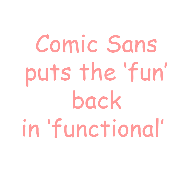
Comic Sans
- It was designed by Vincent Connare for Microsoft in 1994, and yes, it was intended for children, and “to put ‘fun’ back in ‘functional.’”
Italics Were Invented in Italy
- During the humanist movement, Aldus Manutius created these influenced by calligraphy.
Tittle
- This is what you call the dot of the i and j.
X-height
- It’s meant to be the standard height of a lower-case x.
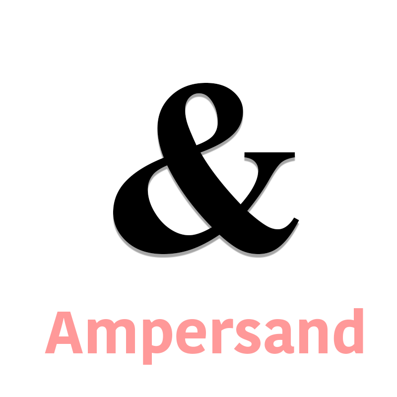
The Ampersand
- Named like that because of the phrase “and per se and”, which means “the character by itself.” The symbol is the combination of the letters “in” and “et.”
Please Share!
You made it all the way to the end of this guide! Hopefully, by now you know a bit more and have a bunch of terms to impress your designer friends.
If you think some terminology is missing from this guide, take a minute to share your thoughts, and if you find this content useful, please share!
Content Marketer at Placeit, a journalist at heart and haiku writer. Writing is my job, but writing valuable content is my passion. I’m sorry for what I wrote when I haven’t had my morning coffee.