")
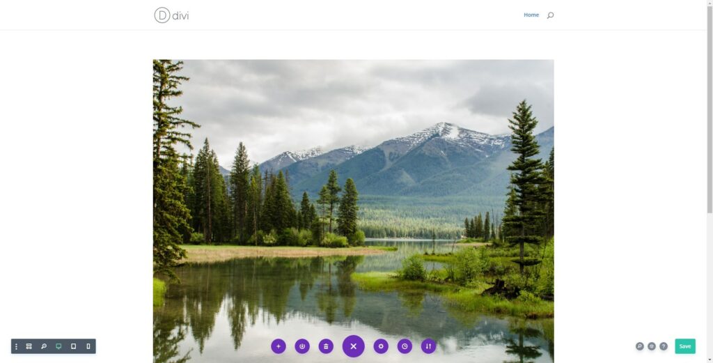
I have been asked by my clients why the section or module they added does not span the full width of the page. Both issues were an easy fix and I knew exactly what the issue was.
By default, Divi adds padding to the top and bottom of the section and the rows. It also sets a width of 80% and a max-width depending on the Customizer settings.
Divi does come with a few prebuilt Fullwidth sections but I find that I like to stick with regular sections for the flexibility.
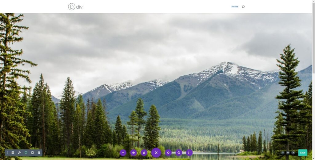
So in this Divi Quick Tip, I will show you how to adjust your settings so that the module will span the fullwidth of the page like the example below.
Step-By-Step Tutorial on How to Make Items the Fullwidth of The Screen in Divi
This tutorial is intended to quickly show you how to adjust the section and row settings so that you item is the fullwidth of the screen on desktop monitors. I will be using the Divi Visual Editor but you can easily do this with the Divi Classic Editor or in Divi Wireframe mode as well
Adjust Divi Section Padding to Remove Top & Bottom Padding
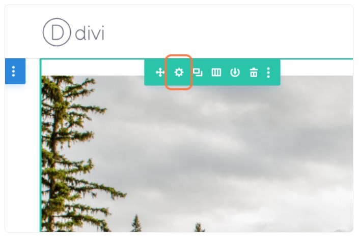
1. Click on “Section Settings” (gear icon)

2. Click on the “Design” tab and open the “Spacing” toggle
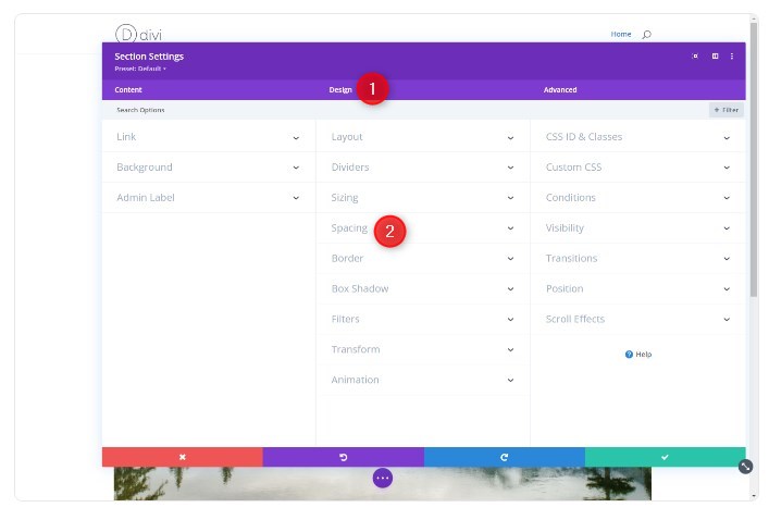
3. Type “0px” in the Top and Bottom Padding boxes
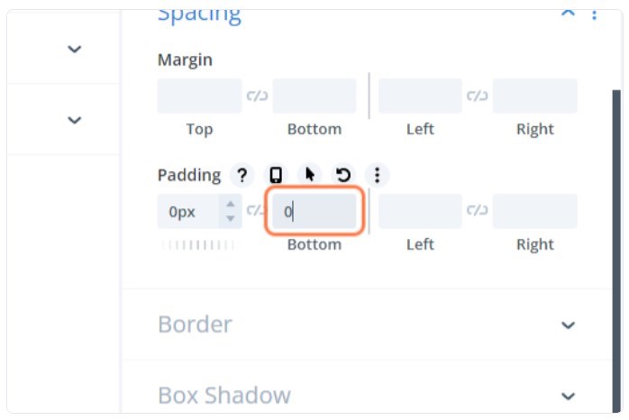
4. Click the Green check mark in the bottom right corner

Adjust Divi Row Padding & Sizing
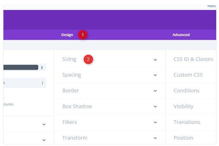
5. Click on “Row Settings” (gear icon)
6. Click on the “Design” tab and open the “Sizing” toggle
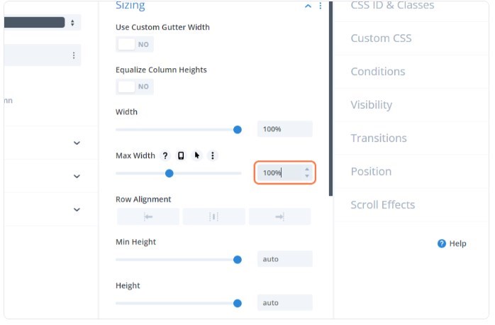
7. Set the width and max-width to 100%
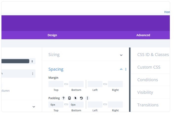
8. Open the “Spacing” Toggle

9. Type “0px” in the Top and Bottom Padding boxes
10. Click the Green check mark in the bottom right corner
Troubleshooting
If you are using the Blurb Module, you might notice it does not stretch fullwidth by default. That is because that module has a max-width of about 550px by default. You just have to open the module settings to make sure it is also set to 100% width & max-width.
So be sure to check the module settings or make sure the image is large enough if you are still having problems getting content to fit the fullwidth of the screen
Make Sections Fullwidth in Divi
And that’s it. As long as the content itself (images and videos) is large enough most modules will stretch the fullwidth of the screen.
If you have any additional topics you would like me to cover, please let me know. Have fun!

Geno Quiroz serves on the Marketing & Technology team at IPX1031, a Fidelity National Financial company and a national leader in 1031 tax-deferred exchange services. In his current role, Geno focuses on website architecture, design, development, SEO/AIO, and digital marketing strategy. His work helps strengthen the company’s digital presence, improve user experience, and ensure that IPX1031’s online platforms effectively support client engagement and long-term growth.
Concurrently, Geno continues to lead Monterey Premier, the web design and strategic consulting firm he founded in 2015. Through Monterey Premier, he partners with entrepreneurs, nonprofits, and growing organizations to design high-performance websites, refine digital sales funnels, and implement conversion-focused strategies.
His hands-on experience building and scaling a client-facing agency has provided him with a real-world understanding of growth strategy, brand positioning, and the operational realities of business ownership — experience that now directly informs and strengthens his work in enterprise marketing technology.