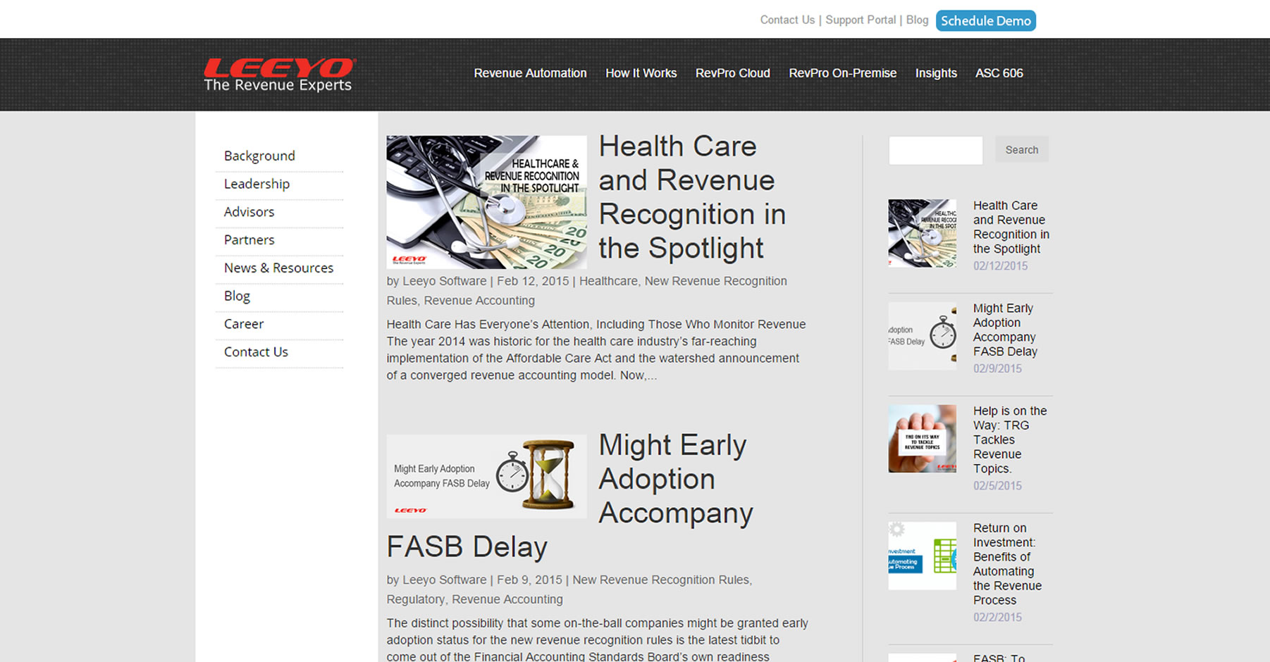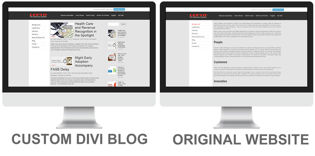
Make Divi Blog Look Like Main Website
Matt Ream was tasked to re-create the companies blog using WordPress because of it’s functionality. But the company did not want the entire site to be re-built in WordPress so Matt decided to make a sub website using WordPress just for the blog.
Matt decided to go with Divi for its ability to look like just about anything you want. So Matt contacted me to help him make the blog pages look exactly like the rest of the site.
Matt had already done all the groundwork setting up the WordPress site, installed Divi and set up the basic layout using the Stylesheet from the companies main website.
So it was up to me to come up with the final tweaks to make it look just like the main website. One of the challenges was that the main website was not mobile friendly but with the flexibility of Divi, we were able to the make the blog mobile friendly.
Project Scope
- Modified the header and menu items to line up like the original website
- Modified left sidebar height, width, padding, hover color and dotted line between each link
- Modified the blog images and alignment
- Added second sidebar to the right using a special widget to add images to the recent blog posts
- Customized the individual blog post pages to match the parent as well.
- Adjusted the code so that the site was mobile friendly while being viewed in the following devices
-
- 23” monitor
- iPad landscape
- iPad portrait
- iPhone landscape
- iPhone portrait


