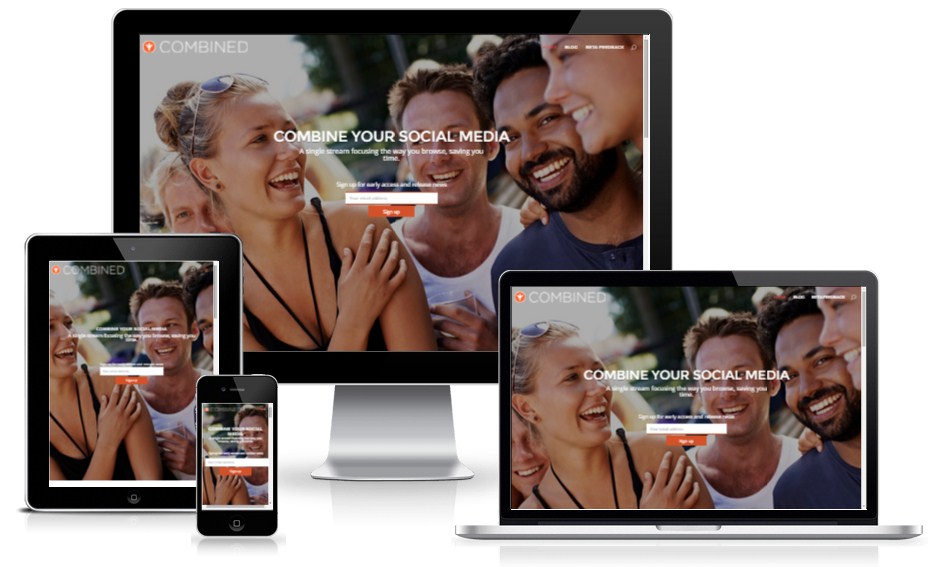
Menu & Mobile Friendly Divi Customization
Sasha Zanjani is an App Developer who built his own website using Divi. While following one of my Divi tutorials (Ghost Home Page and Changing Menu Color in Divi), he found it still was not coming out exactly the way he wanted it.
So he contracted me to further customize his homepage and to help him with all the code needed to get it looking good on mobile devices. He told me he had spent 5 hours just tweaking the homepage.
So in 1 hour I was able to get him all dialed in.
Project Scope
- Modified the header.php to move the logo all the way to the left of the screen and the menu all the way to the right of the screen
- Adjusted the high of the main image so that it fits the full screen on the following devices
- 23” monitor
- iPad landscape
- iPad portrait
- iPhone landscape
- iPhone portrait
- Floated the Slider description so that it sits centered in the above devices. (in iPhone landscape the button is below the fold because height is very limited)
- Shrink the logo on iPhone devices so that it does not push everything else down so far
- Force the Slider content to stay visible on smaller devices. (by default Divi removes it on smaller devices but we can override that)
- Added a bit of code to contain that sentence code within 600px max width so that way it does not have one long string of words on top and only a few words on the second line.


