Websites are becoming easier to arrange and setup. Your website is a location connected via a system of hyperlinks on the World Wide Web. Ideally, a website has more than one page. As you add pages, projects, and posts your website becomes a mini library of information.
The web is a digital library of information but not in terms of a physical location such as a library building or room with a collection of books.
Libraries have their origin as a system to archive institutional records. The earliest library was the Library of Alexandria in Egypt built to house 12,000 handwritten scrolls. Private or personal libraries were made up of written books and started in the fifth century BC. Libraries have evolved all over the world and there are buildings dedicated to the preservation of information.
Information we access has to be organized or we can’t find it. Law is codified, the dictionary compiles words organized alphabetically. So what about a Web Library?
The first digitized document was the U.S. Declaration of Independence, produced in 1973 by Michael S. Hart with Project Gutenberg. The U.S. Declaration of independence was also the first eBook in the world. Project Gutenberg introduced us to the digital library concept. Technology gives us a means to store and retrieve data.
Your website has an organized library of PHP files. The acronym PHP means Personal Home Page using the Hypertext Preprocessor function for open source software.
The innovation of the Divi Library is a collection of well organized, predefined layouts for building webpages. You won’t be staring at a blank page grasping for inspiration, or trying to figure out how to layout a web page.
The Web Page Layout
Before we start using the Divi Library, let’s examine something we already know but needs repeating in this context. The printed page layout is 8 1/2 x 11 inches. A web page is as long as the content you put into the page. The more content on the page, the more the length increases to accommodate the content.
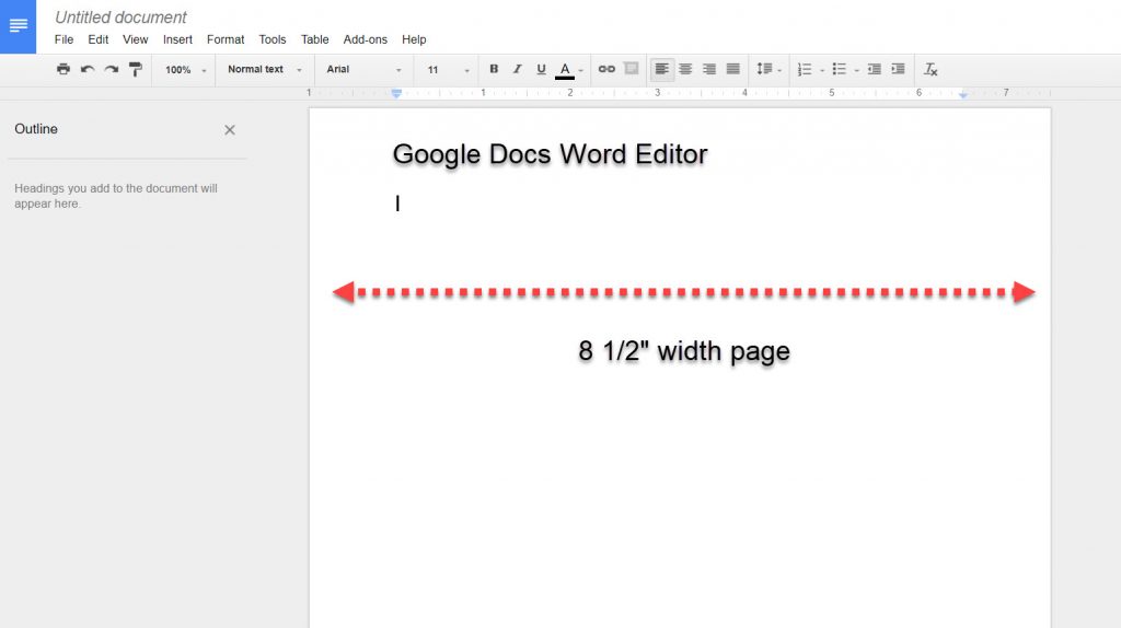
We are used to creating content or writing using a Word Editor. Online or on your computer. The Word Editor is structured in an 8 1/2 by 11 inch page.
Let’s look at Google docs Word Editor for an example.
It’s important to know webpages are measured in pixels not inches. Within the premade layouts the column widths are structured to fit into the context of the web page. For example this blog post is inside a fullwidth text module for the standard blog post size 1080 pixels wide.
The word pixel is a combination of “pics,” short for pictures, and an element. Instead of having to use the words, pictures with elements, the word “pixel” came about. An element is a dot within a picture. The web uses pictures and elements together. This is why things are measured in pixels.
For our purposes, as we start the adventure of website building, all the predefined layouts in the Divi Library are in pixels.
Each Predefined Layout is it’s own book
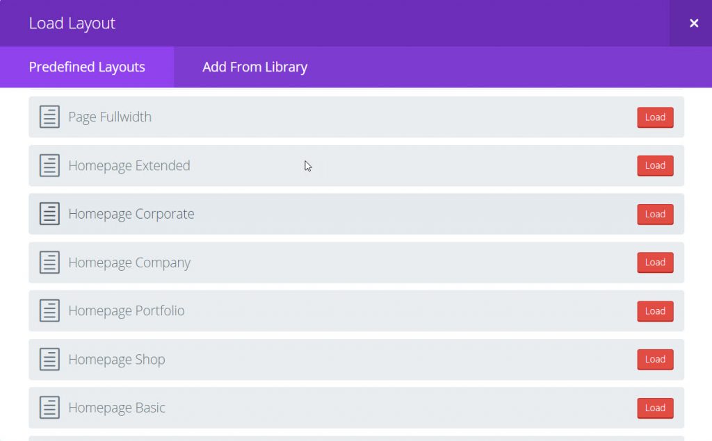
If we were to take for example the Homepage Extended Layout we could write a book on how to layout the Homepage of a website. But we can go to the Divi Library and find a layout to work with when we are thinking of the content for the web page.
This is what the designer does. They experiment with predefined layouts and use the built in settings for specific effects. After you’ve been using the Divi Theme for a while, you’ll be experimenting with the different effects yourself.
Finding Information Stored in the Library
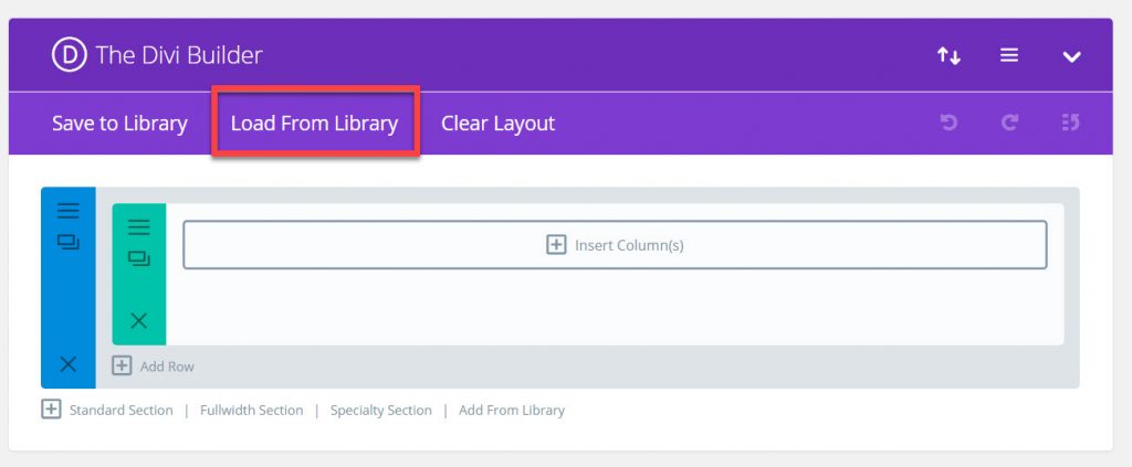
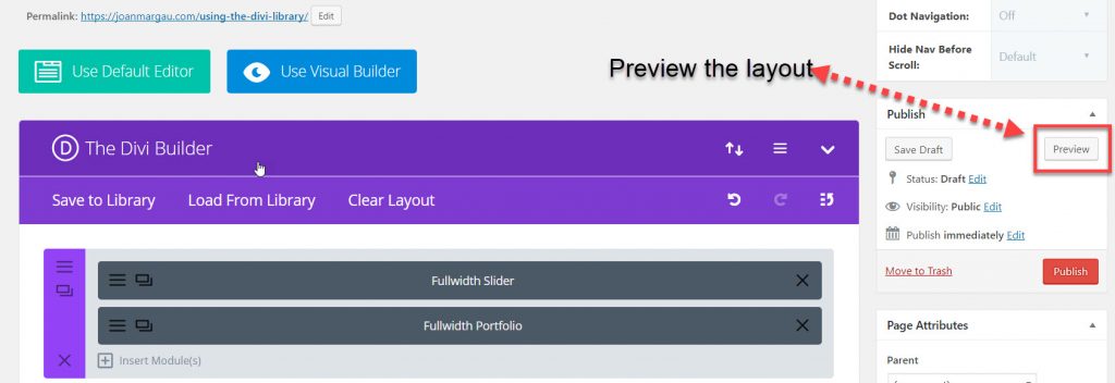
From the page you want to build, open the Divi Builder and select Load From Library.
The Divi Library has 32 predefined layouts arranged alphabetically.
We’re going to look at the Homepage layouts. The Divi Library gives us six different types. As you get familiar with the layouts, you add to the existing layout and remove what you don’t need for your particular layout.
The first one we’re going to look at is the Homepage Portfolio.
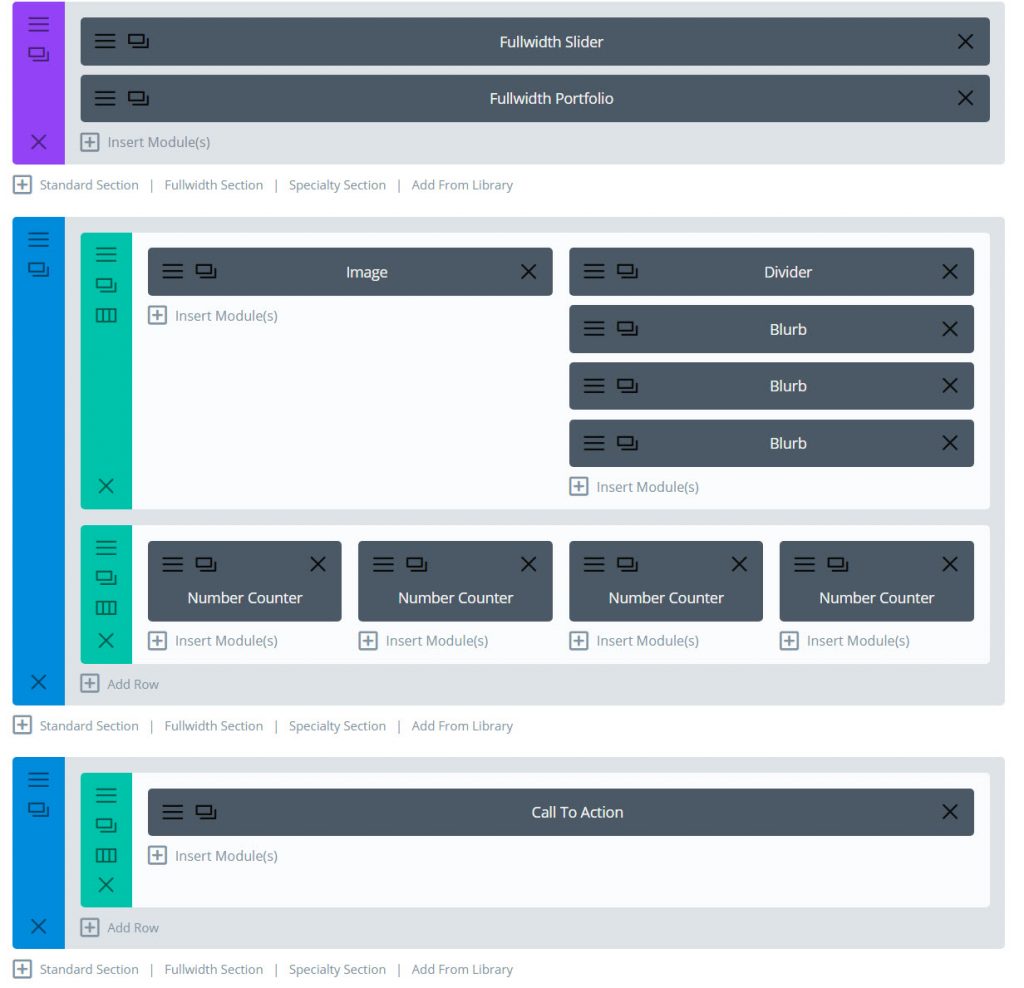
The Homepage Portfolio layout will load into the page editor. This is what the layout looks like. Each module is named with the particular function.
- Fullwidth Slider holds text and a fullwidth image as well as a call to action button
- Fullwidth Portfolio pulls in the Projects specified in the Portfolio module settings
- Halfwidth column with an image and three blurbs. Note the divider module to put a space just before the blurbs for a clean layout
- Four number counters for interesting statistics if desired
- Fullwidth Call To Action module, a short message encouraging your visitor to get in touch
Before using the layout let’s preview what it looks like.The layout comes with dummy text and preset pictures included as placeholders.
The Preview button is on the right, in the Publish section of the sidebar.
Click Preview and the page will open in a new tab next to the open page editor tab. Notice our page is in draft mode and is not yet published to the web.
This is what is in the predefined HomePage Portfolio layout.
Let’s say this is not exactly what you had in mind and want to look at other Homepage layouts. Return to the page editor and find the Clear Layout tab in the Divi Builder.
The next screen you’ll see is this one.
Don’t worry, you haven’t been working in this layout so you can go ahead and click yes.
You’ll be back in the page editor with an empty standard section after the layout has cleared.
Before we continue with loading another layout, the previous layout you just viewed is still open in the tab next to the page you are working in.
Notice there are two different tabs open. The open preview page title is Using the Divi Library and the other tab is Add New Page. This is because the page editor (the one we are working in) has not been saved, it’s in draft mode.
These are the small details you’ll get used to as you work in your website. After a while, you won’t even have to think about it. You can keep the page in draft mode while you’re working in it or you can publish it.
Predefined Layouts
The Divi Library is a collection of layouts. Experiment with the different layouts. You don’t have to be a professional designer to have a great looking website. Every layout has its specific function and was built by a team of designers dedicated to giving you the tools to build a website.
There will always be new additions to the Divi Theme. It’s one of the most comprehensive frameworks to use. The Divi Theme is so good everyone is starting to use it, but don’t give away your secret just yet. Wait until you’ve built your website and then pass on the good news to others.
WordPress and Divi work well together.
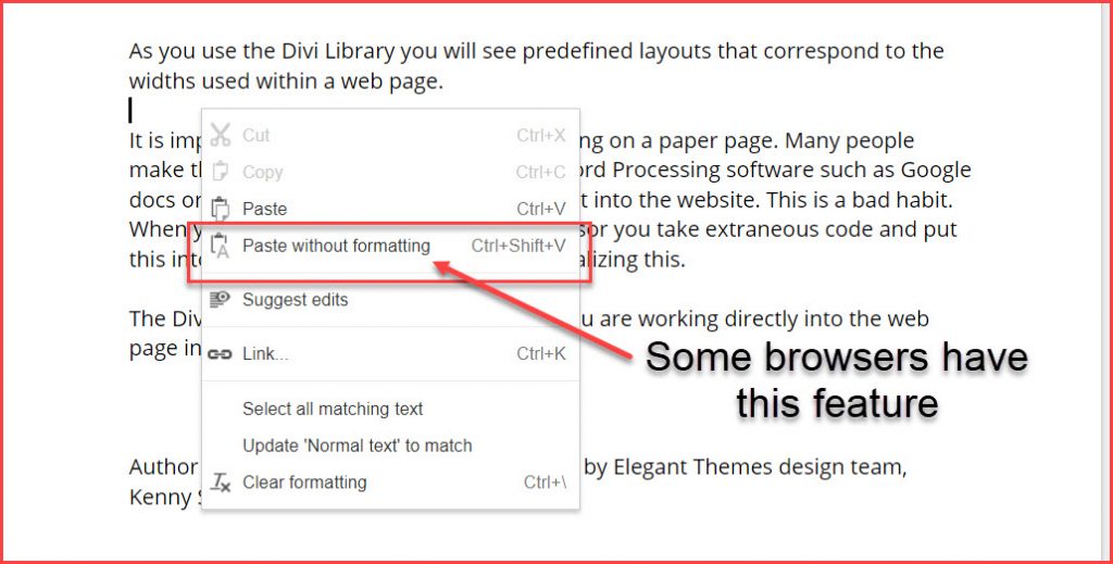
Now that you’ve got the layout you want to use, do you write the content in a Word Editor or do you write the content straight into the module. This depends on how you like to work. I prefer to enter the content directly into the specific module. If you copy and paste the content, be sure your browser has the feature to paste without formatting.
When you’re on the web, there’s going to be code, you don’t want extra code when you cut and paste content.
Working directly into the module guides you within the structure of the column width. This post is written in the fullwidth text module which is 1080 pixels wide. My preference is not to copy and paste into the module.
Over the years using Divi, I have found working within the Divi Framework refines the content within the layout of the webpage.
Divi Empowers the User
Your website becomes a work of art when you use Divi, even though you may not consider yourself artistic. What matters is the content you put into the website to showcase your business and services.
Using the premade Divi Library will start to give you skills you never thought you had. If you’re reluctant to do a website yourself, take a look at the Divi Marketplace. You can learn to use Divi with a predesigned theme. All these themes are built with people who love using the Divi Theme, and it shows in their work.
The Divi Community sprang into existence when the Divi Theme came out in 2012, designed by Elegant Themes. Since then it has grown into a larger community of developers, designers, and users. You’ll be in good company when you join the community. You’ll find tips from experts, and users all willing to share information.
The learning curve with Divi is there, but, I can assure you from personal experience, once you start using the Divi Library you’ll create a website with unique style.
Say it in words – design the future. When I’m not building websites in Divi, I’m writing about Divi. The most versatile, flexible theme, built for the user.

